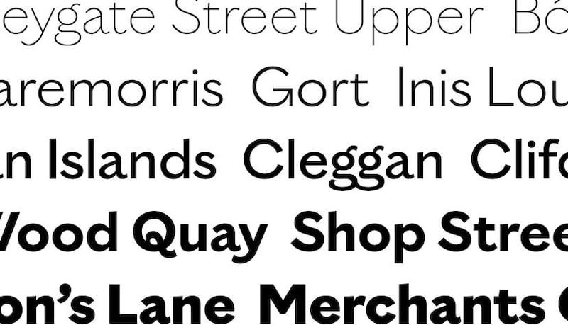
Can you create a typeface specifically for a county? One that would capture the essence of the region: its people, landscape, complex past and future hopes? This was the challenge facing Bobby Tannam, one of Ireland's few full-time typographers, who is based in the National College of Art and Design in Dublin. He was asked by Unthink, a Dublin-based creative design studio, to help them develop a style of writing that Galway2020 could use as a unifying thread to help bring together the myriad different events and projects that would take place during Galway's (now, somewhat beleaguered) year as European Capital of Culture.
As a typographer, Tannam works with clients around the world solving their visual communication problems by blending craft and digital skills to create new forms of typography that might seduce or shock the general public. On the practical side it means working many days nonstop until three or four in the morning. “And then I just start back over again next day. In the end, hopefully, you’re left with a typeface that has its own unique personality.”
The first question he always asks is whether a new typeface is really necessary. “So many beautiful ones have already been created, and there is so much work involved in defining proportions, defining weight, defining modulation and contrast.” All these different elements contribute towards the beauty and functionality of a typescript, but the key element is empty space, “the space in between the letters and words – this is the magic ingredient that gives a typeface its unique tone of voice and visual aesthetic”.
Galwegian typography
So what makes the new Gaillimh typescript unique to Galway? Tannam and Colin Farmer of Unthink believe it was the process involved in creating it. "From ancient ogham stones to recent sign paintings, we wanted to capture as much of Galway as we could, and so we set about immersing ourselves in the landscape," says Farmer.
He, along with Tannam and another designer, Chris Fullum, embarked on a long series of short trips around Galway, visiting towns and villages, to seek out original Galwegian typography on headstones, murals, milestone markers, community halls, clock dials, shop fronts, street signs, boats, pubs, archival documents, flyers and newspapers.
“We built up thousands of photos of things we’d seen, and we took all that back with us,” says Tannam. “Then, slowly, we distilled it down into the spine from which the new typeface evolved. We wanted it to come from something old, but to have a new lease of life.”
The resulting typeface is clean and strong, but most of us would be hard-pressed to notice that it was truly representative of a particular place. They claim that the letterforms are influenced by 18th-century stone carving and also by 19th-century signwriting, but is there much trace of it in the finished form? “Yes, in fact, most of the lower-case letterforms came from a particular carving on the wall of St Nicholas’s Church in Galway city,” says Farmer. “It was an old letterform from the 1700s.”

‘Curved lower leg’
The uppercase was heavily influenced by a piece of carving found in Fonthill Graveyard in the city. “At first we didn’t notice anything special about it, but later, going back through the photographs we noticed the Rs and the Ks had a really distinctive curved lower leg, which gave the finished typeface its personality. It has a kind of a fun element to it. The legs feel like they are bounding across the page, rather than having the straight, expected character.”
These leggy letters have now become a signature feature of the typeface, though Tannam and Farmer realise that most people won’t even notice them. Subliminally, though, these things can make a difference – like how if this sentence suddenly turned into comic sans, your reaction to it would be different.
Tannam suggests we should consider different typefaces like you would different musical compositions. “There may just be one tonal scale, as there is but one 26-letter alphabet, but the combination of these humble elements, given subtle creativity and vast expertise, can create endless compositions. Just like how a single piece of music can evoke differing emotions when played on contrasting instruments, the very same body of text can sound completely different draped in a different typeface.”
Printed word
So, is the finished product a font or a typeface? “It’s both,” says Tannam. “It’s difficult to separate, at times, the form from the content. A font is what you use to create the printed word, while a typeface is what you see.” Creating this typeface left him a little bit sad, as most do: “Completing a typeface is strangely like an unwanted closure for me, there is immediate grief in its completion, but then the typeface is reborn through the designers that use it, and that’s when it lives its life.”

He hopes that once Gaillimh has fulfilled its role as brand typeface for Galway2020, it will take on a life of its own. Both he and Farmer see it as a gift to the people of Galway. “We’re keen that people will take ownership of their very own county typeface,” says Farmer. “We don’t just want this to be a piece of history, we want people to use it, to create and play with it, to make it part of their identity.”
Already, the Gaillimh typeface has won a gold bell award in the design-craft category of the Institute of Creative Advertising and Design (Icad) awards, a silver at the Art Director's Club of Europe Awards, and it has been selected for inclusion in the 100 Archive project which is a curated catalogue of the best of Irish graphic design.


