Like most creative industries, architects talk relentlessly about the brief. This outlines the basic list of accommodation, spaces, goals, aspirations and project particulars in terms of cost, time and quality from the outset of every project. It’s a benchmark that enables architects to know what should be done, as opposed to what could be done.
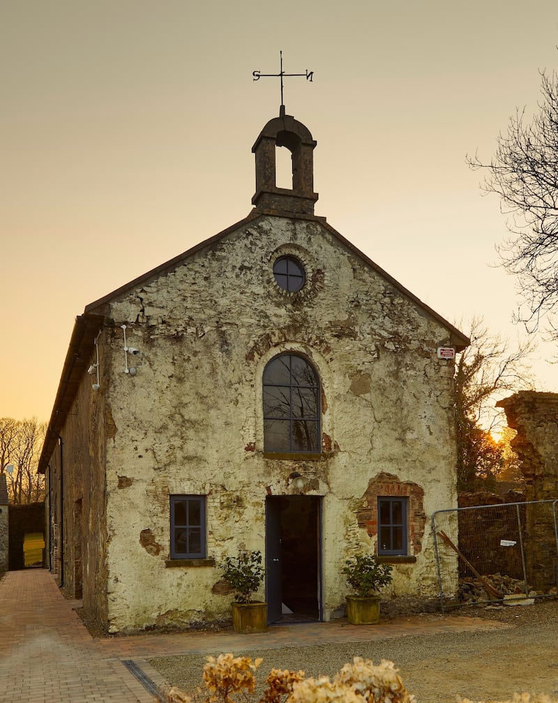
The brief for DHB Architects for this abandoned 18th century coach house (a protected structure) was to provide living accommodation and a gym on the ground floor for a young adult with disabilities and her carer, along with family accommodation above.
0 of 3
It clearly also required the complete restoration of a derelict historic building; challenging to say the least, and enough to fill any architect’s plate without the additional obvious pressure to “make it beautiful as well”.
Whether the inherent beauty that has been so delicately respected and preserved here is an accidental or deliberate by-product of that design brief, what has been achieved in this restoration is nothing short of majestic. This building now works for its owners, while preserving and celebrating its historic fabric. It is simple, humble and respectful of its origins, and it is breathtakingly beautiful.
Long and narrow
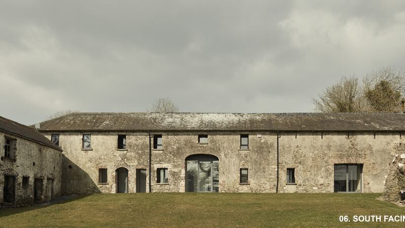
The existing building was most likely originally built to house horse-drawn carriages and the related tack. Coach houses are generally one room deep, long and narrow. Converting one into a home presents challenges for room layouts, access, connectivity, flow, light and circulation, not to mention the introduction of services and utilities.
Operating within strict constraints due to the protected status of the building, the architect’s design involved the insertion of a modern, well-insulated and simply-finished “box” within the old walls.
Existing openings were retained in their original state and a two-storey glazed screen was set inside the south wall. This maximises light and allows each room an open view of the south-facing garden.
It was a simple idea, executed with outstanding skill, but it changed everything.
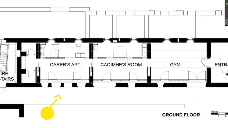
The new layout of the internal spaces is as authentic as possible. They are clear and simple volumes in the 18th century tradition, without corridors and keeping subdivision to a minimum. This led to the spatial approach of creating a series of lofty rooms with sliding screens so that the ground floor can be presented as a succession of spaces in a linear sequence.
Pitfalls avoided
There is no long, depressing, dark hallway to access each room. There is no extension to counter the restrictive width of the existing building. All the usual pitfalls have been carefully avoided here, and the answers were found by looking back, not forward. In respecting the history and the tradition of its era, this new home is simultaneously traditional and contemporary in its approach.
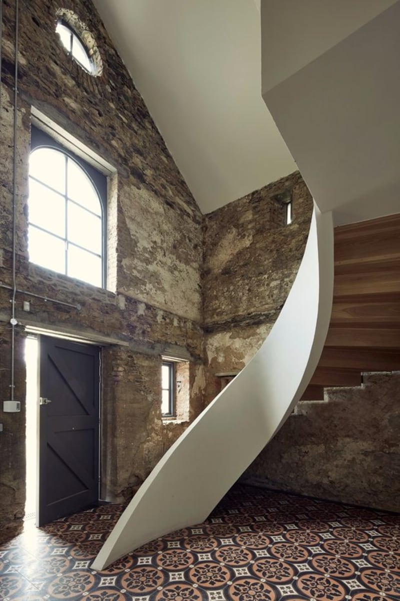
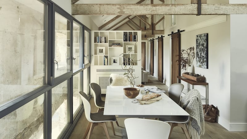
The glass internal walls are set back from the building envelope, allowing you to see the original stone walls. The entrance to this deceptively long house is through the gable end, which has a restored oculus window underneath the belfry. This first room is effectively the new entrance hallway, and the volume is left as a full double-height space.
The walls have been left unplastered, revealing the patina of age as a backdrop for the sculptural sweep of the concrete ribbon stairs and its timber cantilevered steps. Historic fabric, and contemporary sleek lines sitting perfectly side by side. In its essence, design is about emotion, feeling. You can sense the history is still alive inside this house.
There is a responsibility on everyone involved in a project such as this, and architects have a saying that behind every great project is a great client. It appears to be spot on in this case.
