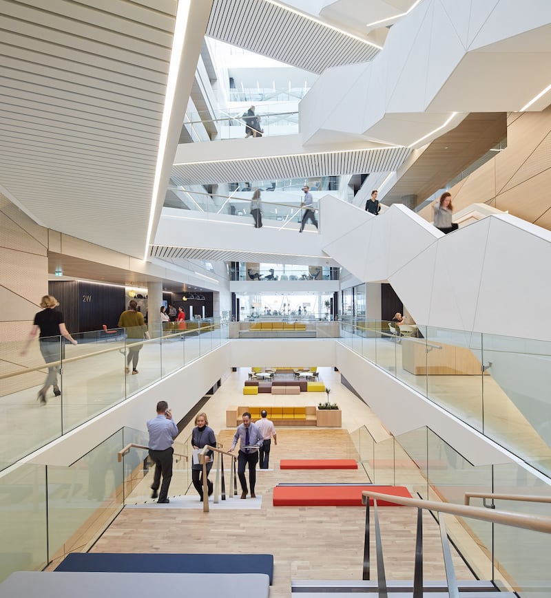
Your vertigo sensors attempt to lift your heart up out of harm's way as you stand on the highest bridge across the 9m-wide atrium in the new Central Bank building on Dublin's North Wall Quay.
Above are roof lights, naturally illuminating glass triangles that dot the wall, creating bright sparks down the building’s eight stories (there are two further floors below ground).
Triangles are a motif throughout these offices, both outside and in. In practical terms they enable the perforated metal skin that hovers over the exterior to be dynamic and dance about, catching the sun or shading the building from it, and aping the ripples on the Liffey river running by. Inside, on white sculptural staircases that weave up through the atrium, the gaps between the triangles stop the plaster from cracking beneath everyday stress.

The triangle is the strongest shape we know, says architect Peter McGovern of Henry J Lyons, and it is being used in the regulatory authority’s new building as a symbol of strength.
Bank buildings were traditionally sturdy structures, typically classical-style stone buildings fronted by columns, porticoes and pediments. They implied solidity and tradition – and thus a reassurance that your money was safe.
This new 28,000sq m building and updated workplace ethos of the Central Bank represents a change towards a more egalitarian and open regulatory authority. The architects mirrored this with “a less autocratic and more open architectural language” guided by metaphors of strength and transparency to achieve balance between the two. The bronzed anodised aluminium coat, comprising triangular and square mesh panels in varying shades, is literally open while subtly depicting stability and strength.
The squares are also designed to conjure sails of tall ships, and the rippling effect of light on the glass walls draws out the water theme. Inside the perforated metal allows lots of light through, while also shading from the sun, helping the building reach its BER rating of A2 and the Breeam outstanding sustainability accreditation: a first for a large office in Ireland, say the architects. Ventilation draws heavily on nature as well.
Concrete shell
The architects did not design the building from scratch but inherited the concrete shell of a structure that was being built for Anglo Irish Bank. Pictures of the stack of desolate concrete floors – left after the bank fell spectacularly in the crash – were used by news organisations over and again to depict Ireland's economic woes. Here were the solid floors that promised so much and the space between highlighted how the Tiger economy disappeared into thin air. The dejected shell was bought in 2012 by the Central Bank, which was increasing its staff numbers to almost 1,500 following the crash. It is a reminder that the bank needs the resources to protect consumers from financial irregularities.
There have been other changes following the move from the Central Bank’s former home on Dame Street. That building feels very open inside, with floors running out beyond floor-to-ceiling glass, but from the outside the concrete bands shout loudest.
In the Dame Street building, designed by Sam Stephenson, the directors’ floor and meeting room is in the top spot, at the apex of the structure, with uninterrupted views over Dublin. Some staff never went into this area in all the time they worked in the building.
The new North Wall Quay building is more egalitarian, with all staff having access to the prime parts. The top floor, where there is a training centre, library and cafe with roof terrace, is for everyone. There are also great Liffey views from double-height coffee and tea stations.
All desks are identical, beside windows and adjustable for sitting or standing.
The governor and deputy, by choice, have offices away from the Liffey on the north side of the building, on the second floor, each in a rare enclosed office. There are 16 glass pods in all (everyone else works in the open plan), which are flexible spaces that can be converted into offices. You’d need to build a strong case for a room of your own, as it goes against the ethos.
Moving and meeting
There are a few large meeting rooms, but most encounters take place elsewhere. At the beginning of the design process, about a dozen architects from Henry J Lyons, armed with iPads, followed bank staff on their jobs – checking them once an hour for over a week – and found that, far from the perception that they were desk-bound, people were often moving and meeting.
In tune with this, the architects created a building with those pods, balconies and other spaces for meetings, as well as several cafes. And all staff have laptops that work anywhere in the building.
In the atrium, you sense the buzz this creates, with views across, up and down to people tapping at laptops in break-out spaces and gathering on balconies.
On the ground floor is an exhibition space open to the public. Conversely, it is a solid part of the building with weighty limestone floors and walls within. Outside are stone benches and sills that undulate to mirror the level of privacy required in each space behind it. Again, both solid and open, grounded and flowing.
The facade will take getting used to, judging by comments, including “Goldidocks” quips. Then again, all out-there buildings do. And a nation in recovery from a financial crash is going to be cautious about (perceived) ostentation and wary of bank organisations made of gold, even if it is actually aluminium.
Yet this is a brave attempt – both in the building and the Central Bank’s ethos – to not repeat a past that put making money before people. The building represents a more egalitarian, open, respectful, interactive and buzzy organisation – and, hopefully, Irish society and economy.


