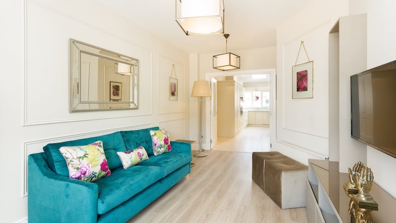
Most new housing developments aim for the highest BER rating and builders often have to forsake the traditional sitting room fireplace, in a bid to keep the house airtight. Likewise, in apartments, the presence of a fireplace is becoming more and more of a rarity.

This creates an aesthetic quandary for owners trying to decorate and place furniture around a room. Traditionally the chimney breast and fireplace was the focal point of the room, creating alcoves either side, generally used for the TV on one side and perhaps a book case or armchair on the other. Opposite of the fireplace was the coffee table and couch and everything else worked around these main pieces. Without this predetermined floor plan, homeowners find they have no centre point to work around.
Showhouses
Interior designer, Karen O’ Rourke from Concept Design, frequently faces this problem when designing sitting rooms in showhouses and has a simple solution. “I’ve found the best way to address the lack of focal point, is to use the longer blank wall for placing the couch against and the opposite one (which typically has a door on it) to create a bespoke TV area.

“Clients often think they should probably hide the television, but I say embrace it, and use it to your advantage. If budget allows, commission a carpenter to make you up a bespoke unit spanning the entire wall or at least two thirds of it. Zone out a square space in the centre of the unit for the TV, and flank it with shelves, or cabinets on either side, and above and below. Not only does this create a focal point but the units provide extra storage and a tidy display area.
Depth
“A very effective design trade trick, is to paint a stronger colour on the wall behind the unit, which creates more depth in the room. You could also add mirrors cut to size on to the back of the shelves too.
“Small drop pendant lighting within the units can add another design dimension as can hidden extra thin LED strips, placed under the lips of the shelves. If on a budget, you can purchase a flat pack TV/shelving unit, from the like of IKEA and paint it the same colour as the rest of the room so it looks more bespoke.
“If you’re home is still being finished, talk to the builder about getting electrical points put in the centre of the wall for the TV when they are in the fixing stage, rather than having to pay extra to retro fit them.”
For the rest of the room, O’Rourke advises, “divide up the remaining walls using panelling or decorative wooden moldings. It gives a great sense of balance, perspective and pulls the room together. These panels can be filled with mirrors (smoked or antiqued), wallpaper or contrasting paint colours that tie in the unit and make the entire room feel cohesive.”


