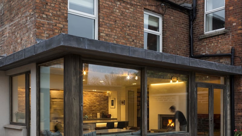
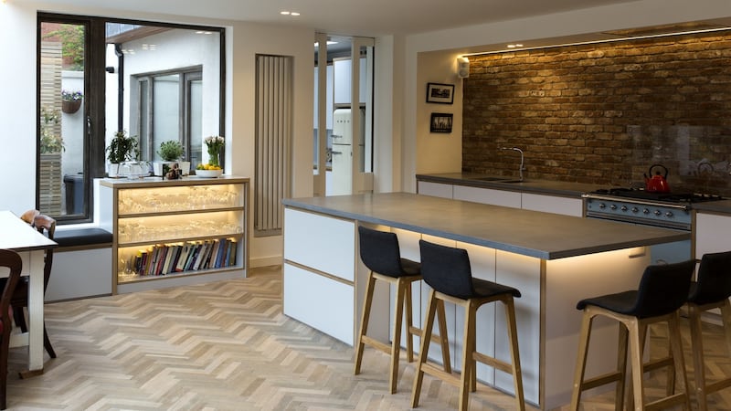
Sitting in the sky-brightened, industrial style kitchen of this Victorian redbrick in Drumcondra, Dublin, with its generous slabs and stretches of timber, glass, concrete and brick, it is hard to believe this room was once light-locked. It is in a handsome, large house that used to be a bed and breakfast, with a central front door. This portal position was one thing that attracted Des and Louisa, who live here with their four children, to the house when they bought it four and a half years ago, "that you came in and could go left or right", says Louisa.

To the right was a south-facing sitting room with two bedrooms above it, and to the left was a living room and kitchen, with two bedrooms and a bathroom above: this side of the house being the private accommodation of the woman who ran the bed and breakfast.

Although the couple loved the house and could see its potential, the configuration and light was all wrong, says Des. “It had a nice atmosphere, the front room had real character and there were a ton of bedrooms,” he said, but “we would sit here [in the kitchen] at the weekend in the dark.”
The elements that kept the rooms free from windows to the outside were two corridors, to the back and front, which led to the living room and kitchen. Not only that but the resourceful former resident had added two utility rooms, with a vast washing machine to cope with guests’ bedding, and a sewing room onto the outside of the kitchen, further clouding the interior.
Architectural technicial
“The lights were on constantly,” says Louisa, recalling rare moments at 5pm in the summer when the sun would come in to the central sitting room. “I’d get really excited and turn the lights off until the sun went down.”
The couple had added an extension to a former home and this time wanted an architect. “We used an architectural technician last time, who drew up what we asked for,” says Des, describing how this left no one making sharp decisions on site and how they would come home each day to find the builders had made compromises where issues had arisen. The end result had “too many materials and it was a triangular room. It gave us what we wanted practically but in other ways it was a disaster.”
This time they wanted ideas beyond the many they had themselves, so instead of giving a brief to architect Gareth Brennan and urban planner Séamus Furlong of Brennan Furlong – who had been recommended by friends – they spent time with them talking about how they lived; although they did ask for a combined space for the whole family, "with light and connection," says Louisa.
This time Des did a lot of research so he could focus on decisions about ideas offered by the architects: “I became totally consumed by the project.”
“I was conscious that I did not need to create one big space,” says Furlong, who left the chimney breast between the kitchen and sitting room with a wide opening on each side to maintain a link and a screen at the same time.
“One big space was great for small kids but now we need separation,” says the father of four, aged from 18 to eight, “and it does work.”
Simple palette
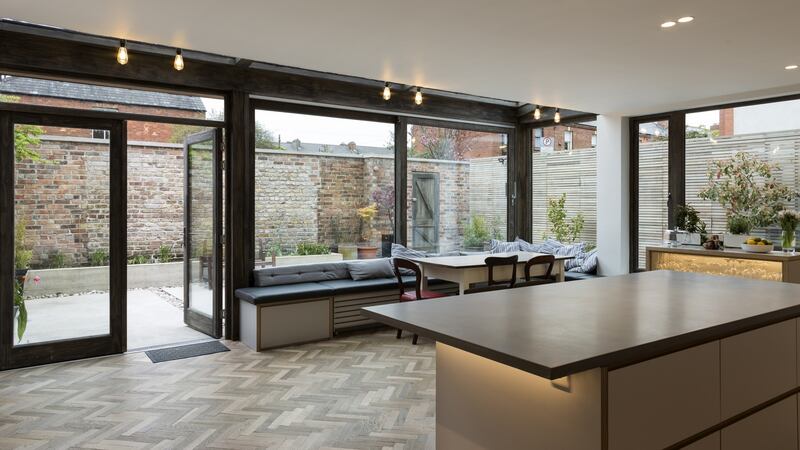
Furlong and Brennan came up with a simple palette: glass, timber, brick and concrete – all drawing from what was in the house already but in a contemporary way. The concrete worktops in the kitchen are glass fibre reinforced concrete (GFRC) which is said to stain less than concrete on its own and the flower beds use shuttered concrete (bearing the mark of wood), while the timber on the house is in treated Accoya softwood, with hardwood on the underside of the overhang, and the kitchen units have exposed birch ply layers on their edges. The splashback wall is in exposed brick and the floor is in unvarnished parquet made to look reclaimed.
The couple decided to keep the eyeline level clear by having all of the kitchen apparatus in drawers, with no cupboards on the walls. They also learned from friends about keeping the island far enough from the kitchen counter to avoid bottle-necks and bumping into each other. “We did actually role play to work out the space,” smiles Louisa, who says the six of them are often in the kitchen at the same time, with school work, including Leaving Cert material, laid out across the island.
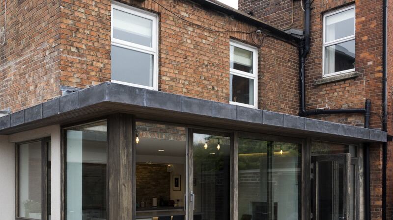
The external space is an integral part of the overall design: “The inside changes would have been in vain if there were not good external spaces,” says Furlong, who hid the washing line, bins and seven bicycles behind a slatted wooden wall, leaving a serene space with concrete slabs separated by thin lines of pebbles, and a bench running along the outside glazed wall of the house, being mirrored both by an overhang above and a bench running along the inside wall.
The exterior was so important they lost some space to it, but you wouldn’t know. “It feels bigger even though it’s smaller.”
That is also partly due to how the space is now used: “We reclaimed square footage from dead space,” says Furlong: which included the utility areas and passages.
One year
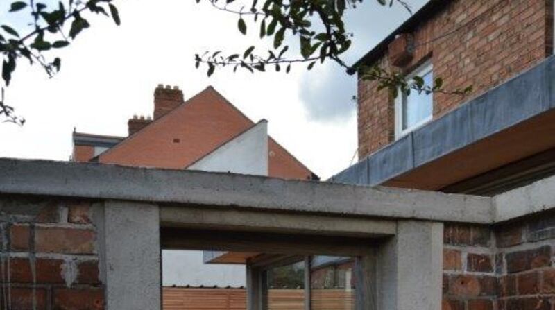
The project took about a year from first talking to the architects in January, submitting plans in April and starting building in July beginning with structural work such as streamlining the plumbing from all of those en suites, removing and putting in improved structural supports in the ceiling and chimney breast. “With an old house you should not go too fast,” says Furlong, referring to the surprises that are always uncovered.
It was one of those builds in which the triumvirate of client, architect and builder, Andrew Griffin, worked well together, with everyone investing in the project and "willing to go one step further".
All of this was done while keeping the inherent character of the house, something Louisa was worried about losing although she soon learned that she “had an ally in Séamus”, who, he says, “could see the value of the home”. Des, who was more gung-ho about changes, jokes: “There were games.”
The family left the house for three months and moved back in “too early”. Living with their coats on and cooking on two camping stoves in the living room although, with both of them being optimists, Des says “you can cook a nice meal on them”.
The builders moved out on December 15th and Des and Louisa hosted 21 members of their families on Christmas Day, on their new range cooker this time.
It was a relief when it was over, says Des, “It takes up an awful lot of time. But I really enjoy living here now.”
The reconfigured first floor, with the wall between the two sides of the house taken down, and a ground floor filled with bright living spaces inside and out has given the family the whole of their home.
“We are using the house in a way we never did before,” says Louisa.
FACT BOX
Builder:
Andrew Griffin Construction, Athy
Windows, doors and joinery:
Derg Joinery : dergjoinery.com
Kitchen, utility and bench:
Darren Langrell Furniture: darrenlangrell.ie
Concrete counters and fireplaces:
Concretefair: concretefair.ie
Industrial pipes lights made by the client


