In a world where remote working is fast becoming the norm, living beyond the capital’s commuter belt and retaining a small city pad might well be the shape of things to come. For a business owner in the Midlands, keeping a city pied à terre has long proved a wily move.
“We live in the country and in a quiet little place, but we have business interests in Dublin,” says the owner, who has a boutique hotel business in the midlands. Having bought the four-storey building on South Frederick Street in Dublin 2 as an investment property some years before, she decided to rent the accommodations on the first three floors and retain the attic as a bolthole for the family. But the 55sq m flat felt more pokey than cosy.
“We didn’t actually spend much time in it as it wasn’t all that nice,” she admits. “We decided to spend a little bit of money to do it up properly. We wanted to get advice on how to do up the place properly – because of the angles and the sloped ceilings it was difficult for me to visualise doing it on my own.”
With a budget of around €35,000 in mind, the property owner engaged interior designer Caroline Flannery (interiorsbycaroline.ie) with a view to putting "more architectural hand" on the project. The brief was deceptively simple: maximise the limited living space.
“It was a really awkward space, with lots of slopes and nooks and crannies, which are notoriously difficult to design anyway,” Flannery recalls. “It’s hard to get furniture that fits into the nooks and crannies – it can end up looking a bit hodgepodge and cluttered. We had to figure out a way to make the space work for an owner, who wanted to use the flat to socialise and relax.”
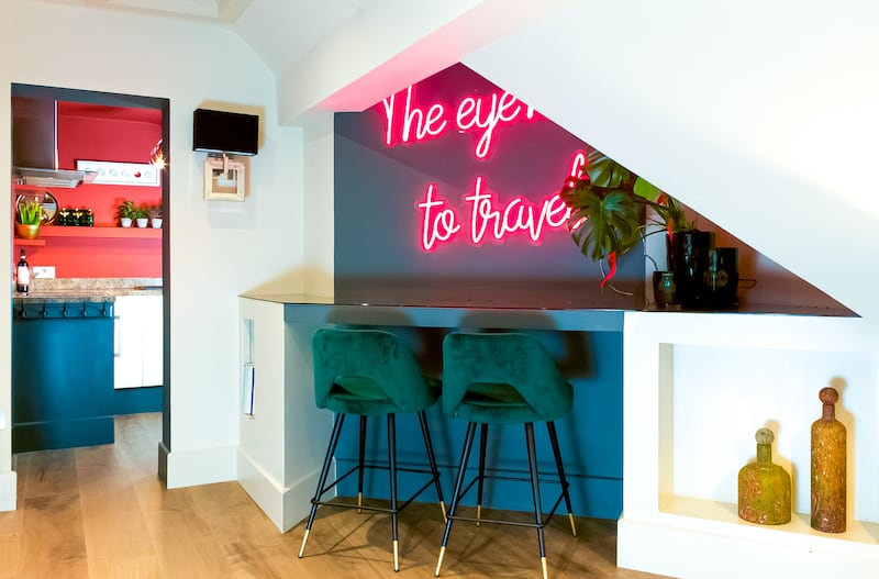
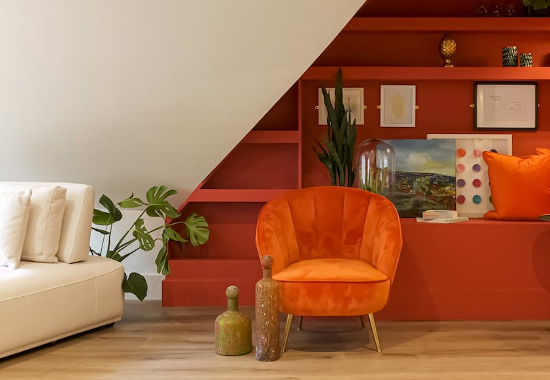
Flannery’s first port of call was to build usable spaces into the nooks. “We built a breakfast bar into the living room, and on the other side, we created a library with a little bench that works as a versatile space.”
Mindful of creating the illusion of space, Flannery used the motto “the eye has to travel”. She removed the existing dark wooden floors for a lighter wood, and removed pendant lighting in favour of uplighters and downlighters built into several of the nooks.
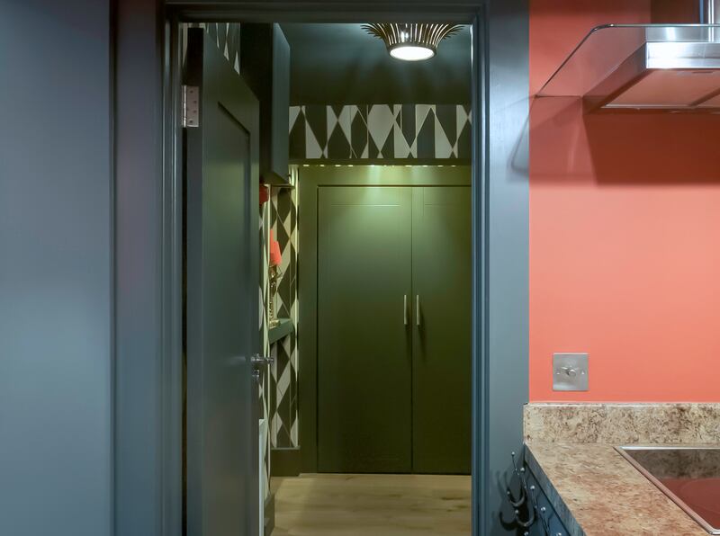
“In the hallway, the brass light fittings now draw the eye up, and painted the ceiling with the darkest colours in the wallpaper that was already there. The trick is to create a sense of wholeness and bring your eye to the ceiling,” Flannery explains.
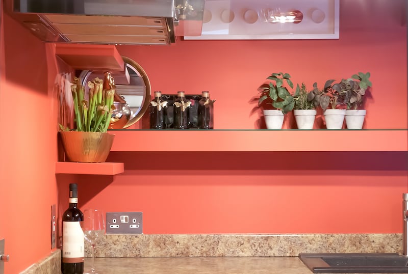
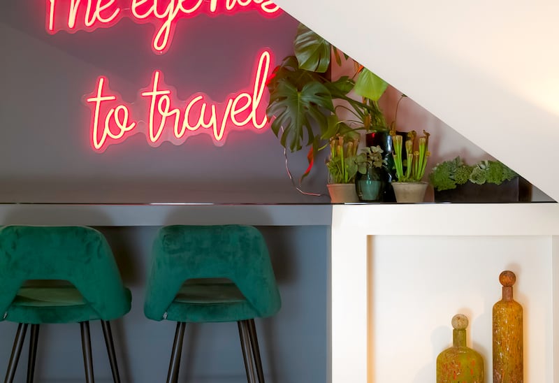
Bold colours dominate the formerly neutral space, and cohesion between the different rooms was key. Aside from the enlivening Down Pipe paint (Farrow & Ball) in the hallway, Farrow & Ball’s Preference Red and was used to update the existing kitchen, creating a contemporary and inviting space. “No matter where you are in the kitchen you have the impression of the same colour, which draws your eye from the shape and size of the room.”
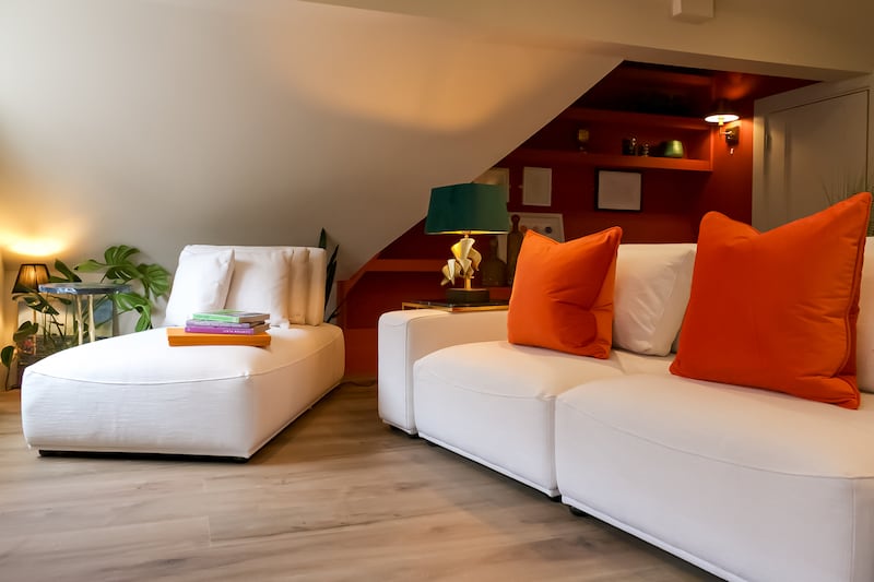
Like the light fittings, lamps and bar stools, the living room’s modular seating, by Eicholtz, was sourced via the Maison & Objet trade show in Paris: “We had to be careful as it couldn’t overpower the room,” says Flannery. “We deliberately didn’t source a coffee table as it would have caused an obstruction in the room.
“When it comes to buying pieces of furniture for a small space, every piece has to be really considered,” Flannery adds. “If you buy a piece that is the wrong scale, it throws everything off and can end up being a big, expensive mistake.”
The best way to maximise similar spaces, she notes, is to start with a scaled floor plan. “Assess the available natural light and observe when the room receives the most and least amount of light,” she says. “Plan your furniture layout and measure each item carefully to ensure it will work in the space – use your scaled drawing for this.
“Bespoke furniture usually works better in awkward spaces. And be careful with paint colours. Always test in situ and observe the colour in both natural and artificial light. Taking your time with this will make a huge difference as to how your room will feel.”


