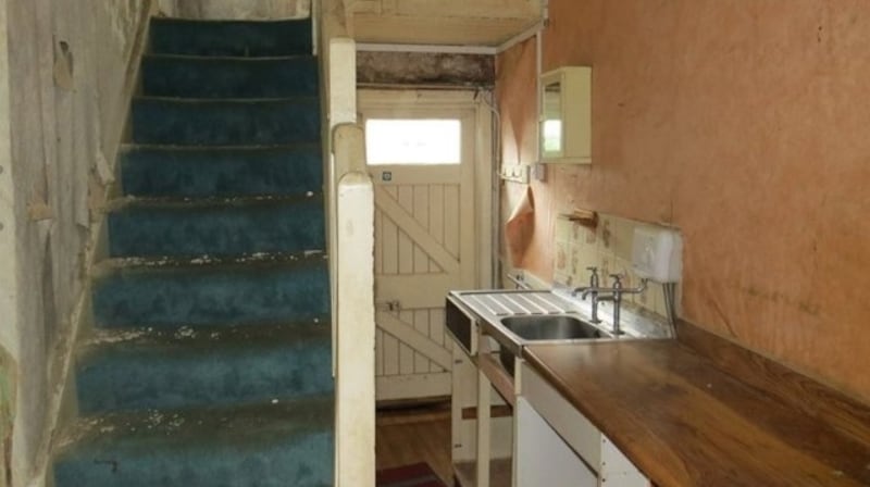
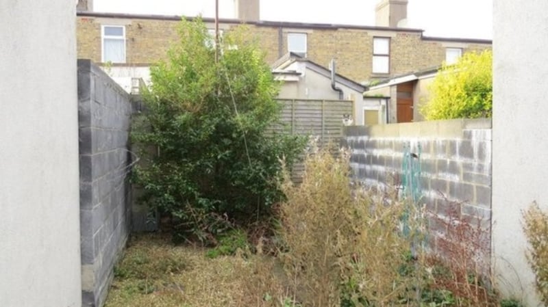
When this terraced redbrick in Dún Laoghaire last came on the market – just over a year ago – one website called it "the grimmest house in Dublin". It wasn't. There are plenty of old houses, particularly those that are executor sales, that come on the market with the most basic of plumbing, a peculiar layout, rising damp, creaking floorboards and a general and very obvious sense of dilapidation.
0 of 13
Number 17 Library Road generated attention because of the price tag – €350,000 in the heart of Dún Laoghaire – and the first viewings were attended by hopeful first-time buyers attracted by the price. They were quickly scared off because this tiny two-up two-down was never going to be a house for this segment of the market – lenders aren’t keen on massive renovation projects and it takes some nerve or, more realistically, ready access to significant funds – to buy a doer-upper.
In the end only builders were really interested, and it sold to a smaller developer with an interiors fit-out business who paid €20,000 below the asking price. Planning permission was quickly submitted to add a two-storey extension to the rear, bringing the accommodation from 60sq m to 70sq m, and the renovation, or more realistically, rebuild, which started by knocking everything back to the front wall, took a further five months. It's all done now – under the supervision of architect Neville Verdon of SBLM architects – and it's back on the market, again through Lisney, this time seeking €500,000.
Energy rating
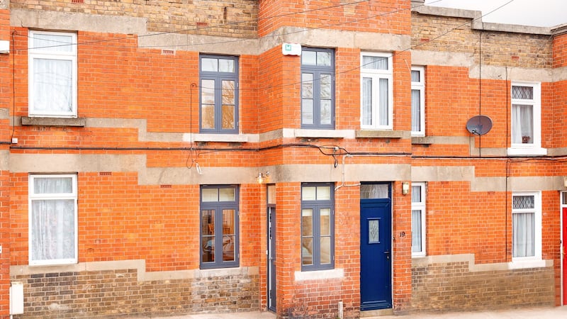
Without even going through the front door, the BER gives an indication of the work – it has gone from a freezing G to an impressive and cosy B2 rating. The new roof and the windows – slim, double-glazed timber units made in the design of the original windows and painted a smart grey – are another giveaway.
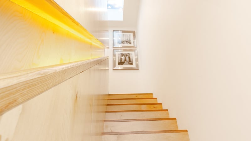
Inside, the layout couldn’t be simpler – an open-plan living area downstairs with two double bedrooms and a shower room upstairs. The staircase linking the two levels is a striking feature, custom-made in beech ply, with concealed storage and nice detailing in the backlit integrated handrail.
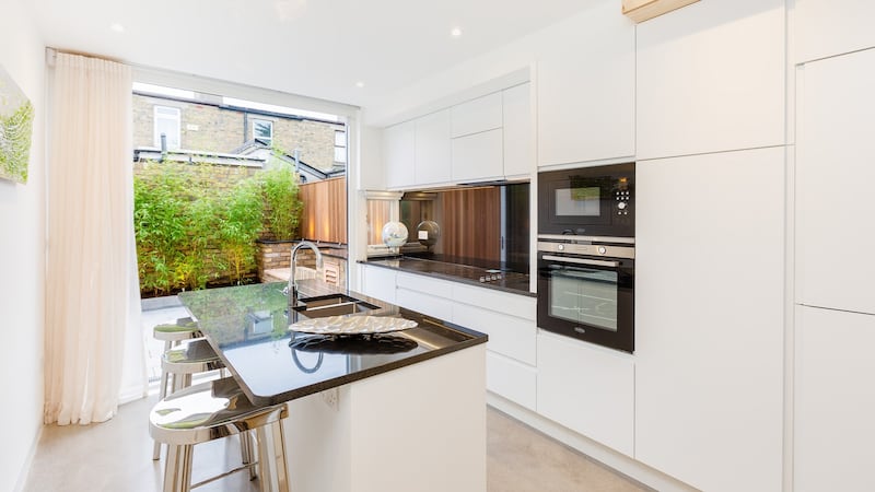
The living area – seating to the front before an inset woodburner, dining in the middle and contemporary fitted kitchen to the rear – has a polished concrete floor, all the better to conduct the heat from the underfloor heating system.
The house’s original design means there is a natural lobby, so the front door – which is to the side – does not open directly into the main room. A floor-to-ceiling glazed concertina door opens out to the westerly-facing rear patio garden. The kitchen – white units topped with black granite – features an island, an unusual feature in a narrow enough space.
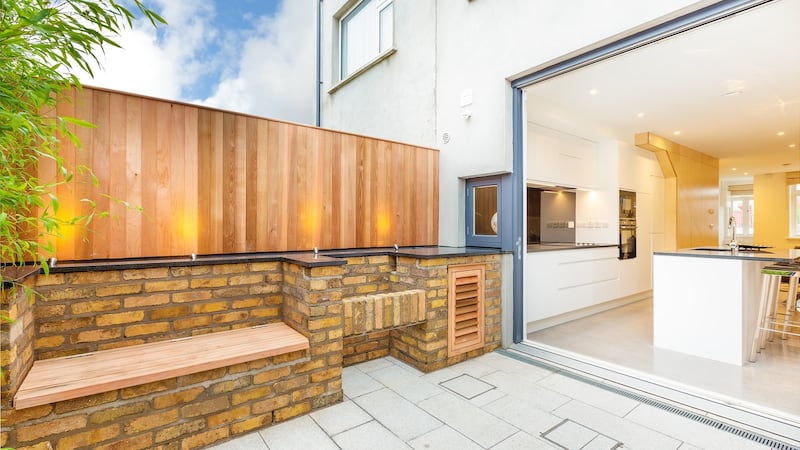
Quirky touches in an otherwise sleek and serious design include the small window in the kitchen just above counter level that opens out to the rear, where there is a built-in granite-topped brick barbecue – it’s like a modern serving hatch. The rear patio has been finished with the house’s original yellow-coloured brick, which was salvaged during the construction.
Upstairs the new extension meant the bedrooms could be reconfigured and a shower room added. Now there are two good doubles – one to the front, the other to the rear. The shower room has an electrically controlled roof light over the shower and there’s another, larger roof light on the landing. Parking to the front is on-street.
It’s all done to a high standard – down to new carpets, blinds and appliances – making it a very different proposition to a year ago with a renewed appeal for a different market.


