For years, the tech worker’s cool surroundings were as much a part of a company’s lure as its generous remuneration packages. But, as brightly coloured furniture and zany decals became commonplace, with banks and accountancy firms buying into the exact same cookie-cutter look, the future of office spaces, has had to, in the oft-quoted words of Darwin, adapt or die.
And adapt they have.
The response to change has been such that when it comes to new space in Dublin, the exposed brickwork and bean bag combination lit by filament light bulbs just doesn’t cut it anymore. It is no longer about superficial good looks.


In the first dot.com boom, primary colours, fun decals, coffee machines and bean bags became the signifiers of how the tech industry wanted to express itself. Now, there’s a very visible convergence of hospitality, retail, office and residential sectors and the mash-up is by design, explains Justin Treacy, director at RKD Architects.
“Ten years ago a home and an office would have been identifiably different in looks and layout but now firms want their staff to feel comfortable at work so they’re stealing their ideas from the hotel sector.”
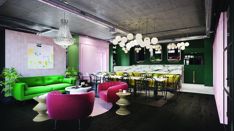
For Iconic Buildings, a firm which offers rented office space using aesthetics as its point of difference, the goal is to create the look of a boutique hotel.
The firm operates nine period buildings and eight office blocks on a leasing model and will, by the end of 2017, provide office space for up to 4,000 people in 250,000 sqft of space. To date, clients include Irish Distillers Pernod Ricard, Jet. com, HubSpot and ENI.
All Iconic Buildings office spaces are decorated in boutique business hotel style, explains managing director Joe McGinley. A former estate agent, McGinley believes the secret to its success is not to use traditional office decorators, but rather multi-discipline designers such sa Susie McAdam and Roisín Lafferty, to set the tone. Custom-made furniture by local craftspeople, contemporary art, flattering lighting layered to create different moods, all prevent the end result looking shop-bought, he says.
Rock stars
Describing their office space at 53-139 Baggot Street Lower as “workspace for rock stars” the look and set-up is seductive enough to appeal this generation’s rock stars; the tech start-up entrepreneurs.
Mindfulness, a buzzword in hospitality for the last 15 years, also comes into play, Treacy says, in the sense of being thoughtful about how you use space.
“In the way cookies or a room-booking app can track behaviour, similarly office buildings are being enabled to react to climatic conditions, so lighting levels may brighten up on dark days to compensate for the lack of natural light; air conditioning may operate similarly with blinds automatically screening glare on bright days. The changes are being made as workers are just thinking about them, without workers even having to register the changes.”
The budgets don’t always have to be huge. Eymer Nolan, project manager with CRM Interior Fit-outs and Refurbishment, recently designed Rubicoin’s office space over two floors of a Georgian building on Merrion Street. For the startup, which designs apps that get people investing, Nolan chose a rich blue with underlying shades of green for the breakout room, a shade in keeping with the building’s heritage but that also had practical considerations. By painting all the woodwork and plasterwork in the same colour, she drew attention away from the rough and ready walls, as replastering wasn’t feasible within the firm’s small budget. And, instead of sanding the worn wooden floors, she laid panels of plywood and painted them in the same shade.
The concept at The Tara Building on Dublin’s Tara Street, was to make the warehouse-style space usable for co-working, for exhibitions and even events.
“The central desks have trestle bases that can fold down and be easily stowed away,” explains Ben McDonald, head of design and video at advertising agency In The Company of Huskies.
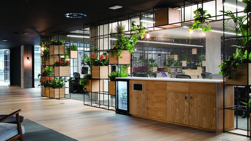
Sustainability is another way to score points in contemporary office design. It’s an issue that matters to millennials. At the recently completed European headquarters of team messaging platform Slack on Dublin’s Hatch Street, ODOS Architects made potted plants a feature of its curvaceous design. Plants visually improve the space, as well as offering health benefits and cleaner air quality as plants convert CO2 into oxygen.
Sit/stand desk
There are practical considerations too, with the sit/stand desk one of the biggest developments, says Richard Crowe, managing director at Bushell Interiors, which recently supplied 1,000 units to LinkedIn.
“Sitting for long periods is bad for workers and this desk can be programmed
to change height every 20 minutes,” he says.
Privacy is another issue. How do you discuss commercially sensitive ideas in an open plan office? Crowe sells sound-proofed meeting booths that can be assembled on site in open-plan offices to allow teams to meet and discuss matters without the whole office listening in. It also helps block out distractions, he explains. These started life as phone booths – small Dr Who-like spaces that allowed workers to take or make a call in privacy.
Bad acoustics can be disruptive too, if you have 20 or more people talking on the telephone. RKD Architects employs acoustic consultants to build an aural model of a proposed design to demonstrate how a space will sound with andwithout specified acoustic panels to deaden the noise. The difference they make is extraordinary, according to Treacy.
And, while tech may still be king in terms of design, the pharma sector is starting to trailblaze, he says. Abbvie, a biotech start-up based in Cherrywood in South Dublin, prioritises good design to attract and retain talent by creating a space that empowers their staff to be creative and collaborative.
“They see that pharma no longer has to be clinical and sterile but rich in texture, colour and form. We see that particular company doing for pharma what Google did to the ‘office’ ten years ago,” says Treacy.


