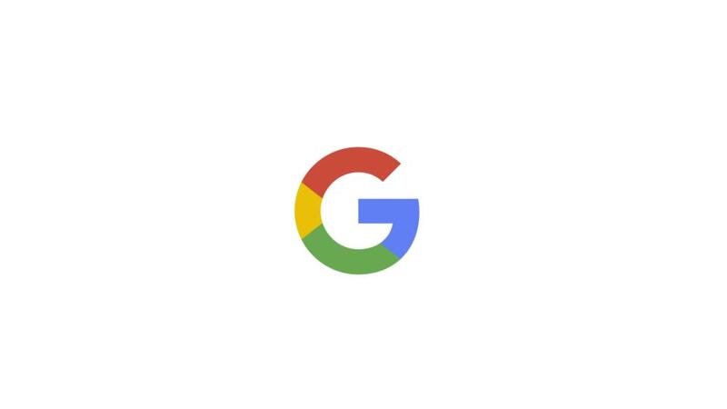
Google has unveiled its new logo in its biggest redesign since 1999.
The search engine company said it tweaked its multi-coloured logo to make it easier for users to use it on apps and mobile devices.
In a blogpost explaining the redesign, the company said: “Google has changed a lot over the past 17 years — from the range of our products to the evolution of their look and feel.


“And today we’re changing things up once again.”
Well-known to its users who make billions of searches on Google each year, the firm’s blue, red, yellow and green logo has been tweaked to a new sans-serif typeface and its colours softened.
Users who visited the search engine’s homepage today were treated to a moving animation scene to explain the revamp.
In it, the old logo is wiped away by a hand and the new one drawn on in its place.
The company said it made the alteration to keep up with the changing way in which people are accessing the internet — often logging on with their phones and tablets rather than a desktop computer.
Google said: “So why are we doing this now? Once upon a time, Google was one destination that you reached from one device: a desktop PC.
“These days, people interact with Google products across many different platforms, apps and devices — sometimes all in a single day. You expect Google to help you whenever and wherever you need it, whether it’s on your mobile phone, TV, watch, the dashboard in your car, and yes, even a desktop.
“Today we’re introducing a new logo and identity family that reflects this reality and shows you when the Google magic is working for you, even on the tiniest screens.”


