1 “It’s pronounced jif, not gif”
So say Pamela Reed and Matthew Rader, although they don't explain why. The graphics interchange format was created by Steve Wilhite of CompuServe. Apparently he chose the pronunciation to echo an American peanut butter band.
2 Think big, think detail


Reed and Rader create deeply intricate 3D worlds and often talk about their characters as people, even down to the type of runners worn by the characters in their Dubstep Dinosaurs video, which are rocking multicoloured Nike Air Jordans.
This can have downsides. “Character designers in commercial projects can be exhausting because you are constantly trying to come up with new ways to rearrange a face on a block,” says Mike from design studio Tado. “Sometimes the characters are brilliant but their story stops when you come to the end of the campaign.” Tado discusses the dozens of characters it developed for a recent Sky Kids television app project, most of which ended up in the character graveyard.
3 Colourful characters
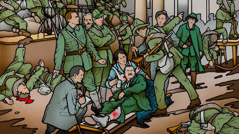
Robert Ballagh's first job was as a musician, but after a country and Irish show pushed him over the edge, he gave it up to follow a painterly path. (His musical influence would live on, however: he sold his bass guitar to a young Phil Lynott. )
Often at Offset, speakers make the mistake of simply cataloguing their career without offering much insight. Ballagh gallops through his work, but the stories are entertaining with plenty to be learned.
Andy Ristaino is a character illustrator who looks a bit like a character himself. With big, curly, red hair, thick-rimmed glasses and a Hawaiian shirt, he talks us through his intricate world of pillow people, sasquatches and flame families. He is best-known for his work on Adventure Time, an animated series inspired by Dungeons and Dragons. And even though he spends some time flicking through images of trees and mushrooms that inspire him, we are kind of inspired too.
4 Never design by committee
When describing their work on the Miley Cyrus-led MTV Video Music Awards, Reed and Rader say the company allowed them complete creative control.
Ballagh is similarly dismissive of heavy-handed interference. He designed our last punt, and was invited to submit designs for the single currency. "The euro we are all forced to use is a classic example of something designed by a committee. When I was growing up, the Irish coinage had animals by Percy Metcalfe, so I decided to use European wildlife. But they decided that doors were more interesting." You really had to be in the room to hear just how damning the pronunciation of the word "doors" can be.
5 Use the dark
Tado describe their Japanese-fuelled aesthetic as “super-cuteness and real beauty coupled with horribleness and darkness. Even our commercial work is described as cute and colourful but if you look past the brightness there is usually something a little bizarre going on.”
Looking at their gorgeous designs for a parade of characters for Sheffield Children’s Hospital, this is apparent. One of the characters is mostly black with one of their typical skullheads. It’s definitely cute, but it’s also a subtle, clever acknowledgement of the reality that most people in hospitals try to ignore.
6 The power of mascots
Tado take a lot of their design lessons from Asia, especially the use of mascots. Government departments and companies use mascots in everyday society, from the “terrifying and authoritative face of the Tokyo police department” to the plastic elephant that goes outside pharmacies, the fish used to mark out safe routes in case of tsunamis, and a nuclear boy used in Fukushima to explain the situation to children.
7 Acknowledge your friends and mentors
In his thoughtful and considered presentation, Russell Mills makes constant references to other artists and collaborators who have inspired him, none more so than Kurt Schwitters, whom he describes as the world's first pop artist. He also mentions Paul Klee, Trent Reznor, Brian Eno, Siobhán Davies and David Toop.
But one of his biggest influences has been a route through the villages of Grasmere, Rydal and Ambleside in England’s Lake District. Mills calls it “a crucible of creativity. All the great romantic poets walked alongside it and a lot of their ideas we’re still living with now. Changes in poetry, when Wordsworth started using the language of the common man, came from this tiny little road.”
Listening to fashion photographer Niall McInerney is like listening to a who’s who of fashion from the 1970s to the 1990s. McInerney refers to Naomi, Yves, Andy, Vivienne, Issey, Grace, Linda, Alexander and Christian by their first names, but doesn’t sound like he’s dropping them.
He was born in Limerick in 1941 and moved to London at 17. He later started taking photos, until 2000. Despite spending most of his time with the world's most famous models and designers, he still took the time to support emerging designers. Among his photographs are images of the graduate shows of Alexander McQueen, John Galliano and Stella McCartney.
8 Keep it personal
Jonathan Barnbrook and Russell Mills both strike a personal tone in their presentations. Barnbrook worked extensively with David Bowie, on albums including Heathen, The Next Day and Blackstar. Several times he catches himself referring to Bowie in the present tense, and says the entire thing is still "extremely raw".
Mills also has a moment when describing a private, “very heavy” commission from a man from Fukushima, whose life was transformed by the accident at its nuclear power plant in the wake of the 2011 tsunami (his mother was among the casualties). An inspiration for one of the works was Prussian blue; the pigment absorbs radiation and, in a desperate attempt to deal with the crisis, scientists used it throughout the landscape, an illustration of how those dealing with the crisis were willing to try unconventional approaches.
9 Make cities malleable
In one of the shortest and best presentations, Paloma Strelitz from Assemble detailed the Turner-prize-winning architectural practice's outstanding work, which focuses on trying to make cities and urban areas more malleable. This ranges from its Cineroleum, which turned a disused garage forecourt into a cinema with curtained walls that rose at the end of the film, to Sugarhouse Studios, an elegant, efficient work and studio space.
Perhaps the most ambitious project is the regeneration of a network of roads called Granby Four Streets in Liverpool. The organisation begins by asking “How could the process of rebuilding the homes help rebuild the social structures?” and gets the local population involved. This runs from encouraging people to extend their typical household cleaning and decorating work on to their streets and immediate areas, to “breaking down the process into basic production lines so everyone could get involved in the production process. This culture of improvisations and hands-on work is crucial to what we do.”
10 Crush hierarchies
The people behind Piranha Bar are suitably enthusiastic about their work. Gavin Kelly sees “no hierarchies of integrity or value between fine art and commercial work or between high and low art”. The company is also pretty liberal about its business plan, and the fact that, rather than specialising, it is working across myriad areas: “We’re doomed to endless creativity. But what if a studio doesn’t have ADHD but a vitality that allows it to work in hybrid ways?”
Sometimes, when describing a commission, Robert Ballagh simply says, "That's what's in there because that's what he wanted." Perhaps the funniest example is a portrait of Charles J Haughey at the Fianna Fáil ard fheis, which contains three images of Haughey: "He was a man who had a pretty large ego, and I think the picture reflected that." When Haughey's adviser came around to check on the work, a nervous Ballagh explained that he had decided to use three Haugheys instead of one. The adviser agreed it wasn't the best idea: "You could really have chanced a few more."
11 Be idealistic
Seb Lester closes Offset as the last act on Sunday and leaves everyone itching to get back to their drawing desks to start a career in calligraphy. Having started his career as a type designer, designing fonts for companies such as Intel and H&M, he decided to make type that "said more", and make "beautiful" more beautiful.
Jonathan Barnbrook takes a similarly idealistic approach to design and music. "I believe in the cultural good of music to enhance people who don't maybe have a very good life," he says. He worked on Banksy's Dismaland project, was a contributor to Adbusters and takes a fairly aggressive approach to getting the work out there. Protest posters about an arms fair were put up in bus shelters around London. How did he afford the space? "You put on a high-vis jacket and show up at night with a tool you can buy in Strike! magazine for five quid."
Regarding fonts, he makes this intriguing observation: “When you redesign the world, there is the big and the small. You can represent utopia in a typeface . . . You can include the whole world in a typeface when you design it. Usually what happens in architecture happens a few years later in typography.
“As I’m getting older, I think you have to offer some hope to people as well. Sometimes it is better to be kind than right.”


