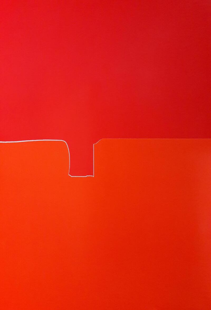
Bone in Skin on Xavier Theunis. Green on Red Gallery, Park Lane, Spencer Dock, Dublin, until November 16th
greenonredgallery.com
★★★★★
In his first solo exhibition at Green on Red, Bone in Skin on, Xavier Theunis plays his cards pretty close to his chest. Or so you might think at first glance. The available space is generous, with a huge glazed wall, framed in a grid pattern, looking east towards one of the largest active developments in Docklands, the new Salesforce European headquarters at Spencer Dock. Theunis has evidently cast his eye over the interior, though, and come up with his own plan. That plan is perhaps surprising, but ingenious.
Theunis was born in Anderlecht, Belgium, and studied art in Nice, at the memorably named Villa Arson (despite its incendiary title it is a national school of the fine arts). He settled in Nice and is based there still, showing with Galerie Catherine Issert. His work, which is constantly evolving, has been described as a cross between painting and sculpture, but that doesn’t quite do it justice. Aspects of drawing, photography, collage – or perhaps mosaic – painting and installation have all played a role. Fair to say that he thinks spatially and has a passionate, even obsessive interest in process, materials and finish. He is also drawn to conceptual elegance.
Take what he opted to do at Green on Red. His show includes a number of flat, coloured works that on cursory examination might be paintings. Rather than hang them on the walls of the gallery, he has opted to make a kind of gallery within a gallery and hang them there. The inner gallery takes the form of a spiral corridor that unravels from a substantial pillar in the building. Its walls are built in sections, and each section is essentially a crate in which the works were transported. There’s an echo here of the sort of strategy seen in installations by Mark Swords, Sonia Shiel or Tadhg McSweeney. Not to say that anyone is influencing anyone else, but clearly it evidences a common desire to transcend the conventional model of the gallery display.
He allows the joins, the process, to show, acknowledging that we are looking at a constructed space
Disparities in the sizes of the works entail disparities in the height of the spiral’s walls. Generally, though irregularly, they descend towards the centre. Theunis, who has a liking for jumps and disparities, hasn’t just yoked the crates together. First, a little investigation reveals that, apparently like everything he does, the crates are beautifully and exactly designed and made. Then, with some friends, an engineer among them, the artist spent about a week creating the spiral. Each crate is covered and skimmed with plaster to a perfect finish, in terms of smoothness. But he hasn’t applied a finishing coat of paint, he allows the joins, the process, to show, acknowledging that we are looking at a constructed space.

In his own terms, it is a glimpse backstage. In the same parlance, when you go into a gallery normally everything you see is onstage, it’s contrived; to some extent he suggests, a fiction. His own works distinctly suggest that is more a description than a criticism.
As regards the works hanging on the walls: Theunis’s primary medium is coloured, self-adhesive vinyl. The vinyl is applied to, for the most part, aluminium composite panels. They are mounted on stainless steel stretchers and framed in galvanized steel. In various colours, the vinyl is cut and applied to the aluminium and, it would appear, grouted like tiles so that the surface is flat and smooth. Then the surface is varnished.
Colours are generally applied in approximately horizontal bands. Arrangements of relatively few colours alternate with denser layered compositions from work to work. One recurrent pattern abuts three vertical stacks of many colours, creating arresting, optically rich if slightly challenging expanses. Most of the pieces in Bone in, Skin on evoke landscape to some degree, though as the title of his show suggests he has in the past referred quite directly to design and interiors, with adjoining bands of colour recalling book spines arranged on a shelf, for example.
For his shadow works, Theunis uses the adhesive vinyl patterns that are applied to bus and coach windows for shade
The vinyl is mainly a commercial, decorative material. It’s notable that virtually all of his materials are similarly industrial, with industrial connotations. The works have something of the sleekness and polish of hi-tech products. They nod to good taste and a sleek design aesthetic, while holding these qualities at a slight distance, for examination.
At they same time, they make sense within the context of painting’s history. Minimalism has been mentioned as a point of reference. Certainly the circular Untitled (shadow #18) appears minimalist: a shimmering grey disc. For his shadow works, Theunis uses the adhesive vinyl patterns that are applied to bus and coach windows for shade. He apparently uses two grades of shadow to create the desired effect in #18.
While the individual pieces he makes are enthralling, and incidentally labour-intensive, there’s no doubt that the environment he has created is just as much a part of the work. He is apparently a perfectionist who dwells on every aspect of a project, from the smallest detail to the entire package. Which is why it’s important to see the exhibition in the round, rather than, say, as a series of attractive images online. He clearly thought about not just the interior of the building it occupies, but also the wider Docklands setting into which the spiral he has created figuratively unfurls.


