In her 50s, the owner of this Victorian house in Dublin 6 came home from abroad, to the city where she'd grown up. She wanted a place she could live in for many years and the term "forever home" came up often as she liaised with interior designer Ruth Noble. The result is a house with bespoke fittings and storage which has lots of colour and texture but is also calm and comfortable.
She bought the house in the summer of 2016 and it was perfectly liveable in, something which the owner did, to get a feel for what she wanted. She had wondered whether to extend or reconfigure, and eventually she did the latter with the help of Crean Salley Architects.
The kitchen at the back of the house grew in scale and brightness by incorporating a corridor and utility room into the main space and removing a column. A rooflight, two new sash windows to the side and bigger glazed doors to the garden bedazzled the room. “They reclaimed a huge amount of space,” says Noble.
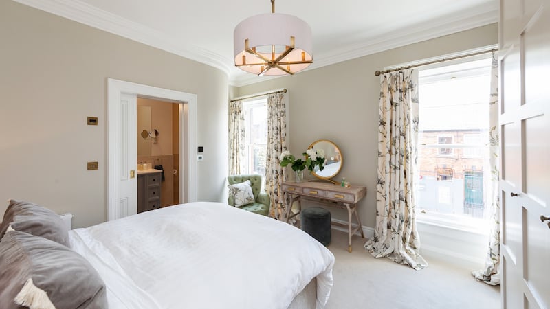
Two larger bathrooms were created by combing a bathroom and office on the return, which now has two windows, and knocking through an en suite and walk-in wardrobe in the main bedroom.

“She wanted something really personal, and was very open to options and ideas,” says Noble, who presented the owner, who had already refurbished a number of properties, with a room-by-room scheme and gauged what piqued her interest. “When I presented anything colourful and textural she was very much drawn to that: she loved velvet and plum colours,” says Noble.
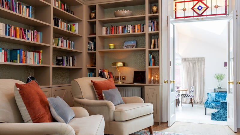
So now the house has velvet sofas and armchairs throughout – some of them pieces that the client had already, which were reupholstered, along with new furniture sourced or designed by Noble. For example, in the front living room there is bespoke blue velvet sofa and in the room between the living room and kitchen, a relaxation space and library was created which includes velvet armchairs.
Picked-up aubergine
This is Noble’s favourite room: “A space where you can relax and curl up for a peaceful read,” she says. The book shelves (backed with patterned wallpaper) and cabinets were designed by her as was the stained-glass panel above a door, which draws together the colours used throughout the house, including blue and aubergine. The aubergine is also picked up in trimming on the stair carpet.
In designing a colourful scheme like this it is “important to ensure there is a good flow within the house”, says Noble, “and keep in mind that, as you move from one area to the next, there is some kind of continuity. Colours need to complement each other but don’t necessarily have to match up.” Noble also balanced flooring; from oiled, engineered oak to large kitchen tiles and rugs.

“Much depends on light and the scale of the spaces. In this house we’ve used a calmer colour in the entrance hall to keep it bright but, to give it a sense of identity, it’s not neutral or white. In the reception rooms we used warm stone colours. In some properties we might have these darker and more dramatic but here we wanted the space to be calm, comfortable and welcoming.”
The walls are mainly pales as a backdrop to the colour that comes from sofas, curtains, rugs and cushions, along with surprising elements such as an aubergine cabinet in the kitchen amid the grey units “to add character”, says Noble.
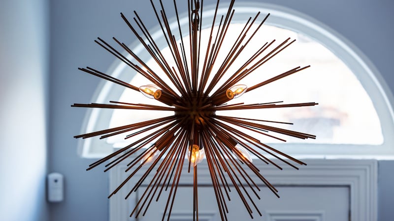
Texture also comes in the form of sculptural and spiky lights, which are part of the mix between modern and period pieces: “You have to respect the integrity of a Victorian house but I also wanted to really update it and have more contemporary elements running through,” says Noble.
Warm metals
Another theme carried through the house is warm metals: it is picked up in antique brass door handles, sockets and switches; bronze kitchen handles and wall lights; the brass light in the hall and landing; and brass side lamps in the third bedroom.
Lighting was an important part of the design, says Noble, who ran the levels from high to low; from recessed downlighters in the kitchen ceiling and units; dimmable pendant lights throughout the house; and floor and table lamps for low-level ambient light.

Storage was designed not only to suit the client’s tastes but also to steer clear of common mistakes such as built-in wardrobes that overpower rooms. In one of the three bedrooms storage is behind panelling, in another it is recessed beside a fireplace and in the main bedroom Noble stepped back two-end cabinets so that when you walk into the room you are not met with large gable ends. “What you lose in depth, you gain in circulation,” she says.
For all its colour and texture, the house retains an air of calm. “I’m really pleased: we’ve achieved a very comfortable home. Working with a client who was very open to suggestions meant we could be creative throughout the house,” says Noble.
WHERE TO GET IT
Tiles on the kitchen floor, in the bathroom and sanitaryware, taps and fittings: TileStyle
Flooring in the hall, front living room and study: Kahrs Engineered flooring at TileStyle
Fabrics from Manuel Canovas, Osborne & Little, James Hare Silks, and Travers
Furniture and lighting from Ruth Noble Interiors


