New build homes or large scale kitchen extensions often leave homeowners with vast square boxes at the rear of a house.
These spaces are great for open plan living, with lots of space to circulate, cook and chill in, but they also throw up the dilemma of how to create cosiness and how to keep the individual zones defined, yet connected.
Interior designer Suzie McAdam, says she is tasked with this type of project every month and while rooms differ in dimensions, the formula for success is pretty much the same.
“Typically, we’re dealing with a large room, with squared dimensions and no traditional focal points such as mouldings or a fireplace. Homeowners mostly want to get three to four zones working harmoniously in the space: the kitchen; the dining area; the lounging area; a space or play area for small kids.” says McAdam.

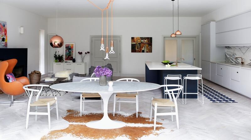
McAdam relies on three design elements to make her schemes work: accent colour blocking mirrored throughout, lighting in the same metal/material but in different styles and various rugs to nail cohesive zoning in one room.
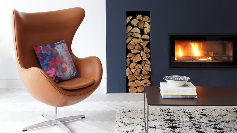
“I start with the lounge area and install a false wall to create a fireplace of sorts, it can be as simple as using MDF and plasterboard, or as complex as installing a contemporary fire and a flu. If it’s the former, I build in an opening and fill it with a mirror, candles and logs to create a focal point. The breast then gets painted in the accent colour, which in this case is navy blue, and I place a nice deep pile, cosy rug, under the couch and coffee table to add more texture and anchor the lounge space.”
The accent colour is then mirrored in the kitchen zone - either in the colour of the cabinets or the island.

Layered and varied lighting is key in the kitchen says Mc Adam, “task lighting is great for when cooking but at night or when entertaining, you should have mood lighting in the form of LED strips to create a more relaxed atmosphere.
“Pendant lighting hanging down over the island acts a subtle boundary line for the kitchen zone too.”
In the dining area McAdam says she chooses rugs in an unusual shape or material, like a cowhide, to give this section a design focus and for a hit of hygge, she would add sheepskin throws to the back of the chairs. Upholstering the dining chairs in a fabric that picks up on the accent colour or the cushions on the couch is another of her design trademarks.
The play area needs to be tactile and fun, so is demarcated with a rug and colour pops.
“I love the Pinocchio rugs, made from coloured felt balls for kids’ zones, they’re funky and feel great to touch. Toy storage needs to be accessible so if you’re installing a new kitchen, ask the builder to add in a few more floor cabinets here, and use lift lids rather than doors.
“Or fit flat pack cubes and fix MDF facings painted in the accent colour onto the front of them to keep the zone interconnected. Add a few playful touches over the cabinets like chalkboards and clipboards with their drawings on skinny shelves to finish the scheme off,” says Mc Adam.


