"When I would come in the back door there was an instant feeling of 'Oh, no'," says Aoibhann Byrne, describing being faced with a dark hallway and clutter, with no storage.
It was the large open-plan kitchen and living room, and surrounding garden, that attracted her and her husband, John, to this five-bedroom Georgian-style house in Trim, Co Meath. They bought the newbuild when they moved out of Dublin nearly nine years ago, returning to the countryside they had both grown up in: they wanted the same for their then newborn son Cathal.
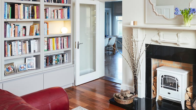
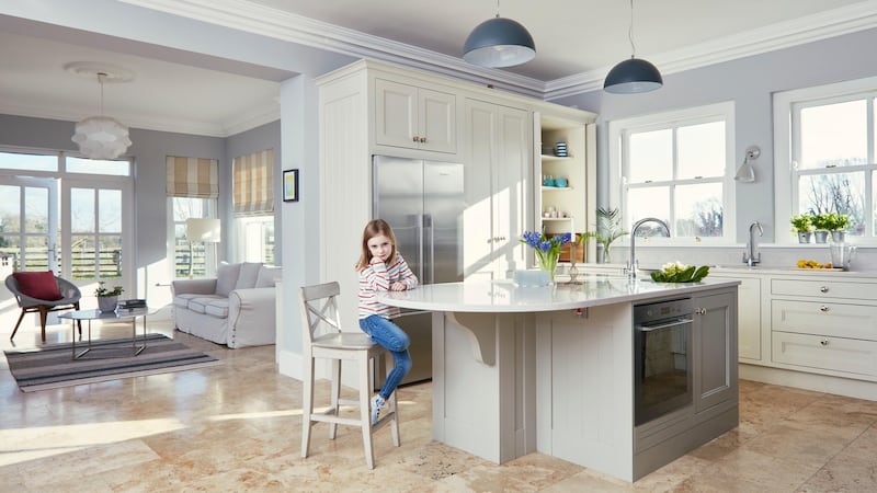
Three years ago they put in a new kitchen and window, and added a door to the playroom (by which time Cathal had been joined by a brother and sister, Luke and Éabha) to prevent them having to go through a hall from the kitchen. “It increased the functionality of the house a lot,” says Byrne.
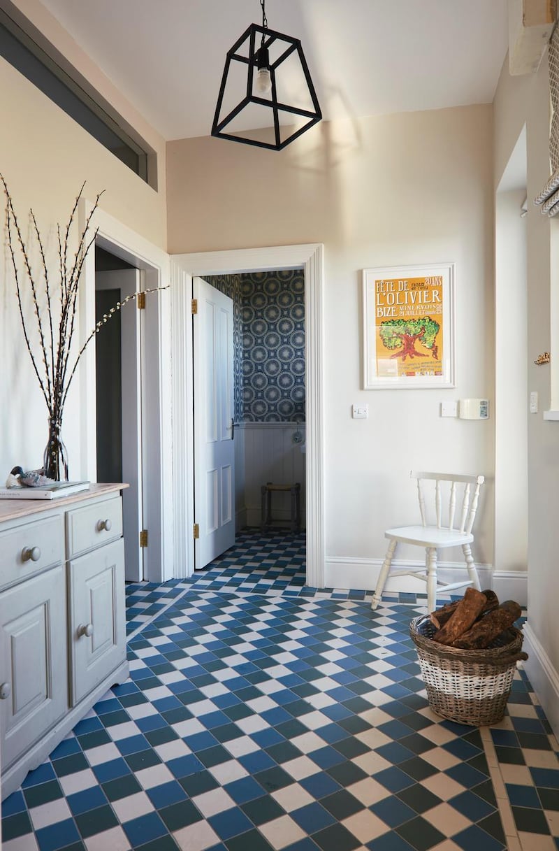
But aspects still weren’t flowing. At one stage the couple thought of extending into the garage but realised they had enough space, it just wasn’t functioning well, especially that back door. “When you arrived with shopping bags you could barely get in,” says Byrne. “And we could never find anything: there was no storage for coats, boots, tennis racquets . . .”
Interior designer
The couple contacted interior designer Ruth Noble to give guidance on an overall scheme. Byrne had a clear idea of what she wanted in terms of individual items but it was pulling it together that was "intimidating".

Newly returned from five years working in London, Noble met Byrne in January 2017 and was presented with the results of Byrne’s scouring of Pinterest and interiors publications. En route she had ripped out pages and placed them in various rooms. “Pretty quickly I could see what I liked – and certain colours kept recurring – so when Ruth arrived I presented her with all of this information and she seemed very happy with it,” says Byrne laughing.
“I was nervous because I had never contacted an interior designer before and I really wanted to get my taste across. She took that on board and came back with great schemes, and lots of choice within them.”
Noble is skilled at working with what people want, while considering other factors: she liked the proportions of the house, the light coming though most of the sash windows – “everyone’s looking for light in Ireland” – but she felt, along with Byrne, that some of the fittings were a bit heavy, that the more contemporary look Byrne was after would work, while respecting the Georgian style and the fact this was to be a cosy, family home.
So the back of the house was reconfigured, as was an office at the top of the stairs, and the attic. More natural light was brought in, bolder paint and carpet colours were used, fittings were updated and lots of storage added. The latter was not just about quantity: “The key was to make the storage work while looking aesthetically good too,” says Noble.
The back door was widened and more glass put in. A utility area, bootroom and cloakroom were created along with a new window.
Open-plan office
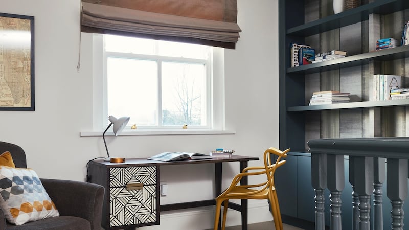
The office at the top of the stairs had its wall removed. “On the landing there used to be only a bit of light from a very small window. There was a box room at the front, used as an office, but nobody wanted to go up there and be tucked away from everyone else,” says Byrne. “Nobody really works that way anymore.” The new open-plan office is much more functional – with its comfortable chair, files and books, shelves and new light fittings: “It changed the landing completely, and light floods in,” says Noble.
The attic was also updated and made more functional by removing a door and wall at the top of the stairs and adding a Velux, to bring natural light onto the landing. The attic was divided by a wall and double doors with contemporary handle-free storage to one side and a wallpapered guest bedroom on the other.

“One side feels clean, contemporary and functional, as an area to sit and relax, while the other side is a comfortable, large guest bedroom,” says Noble who used Blackrock Kitchens/Country Kitchens to make the bespoke storage throughout the house.
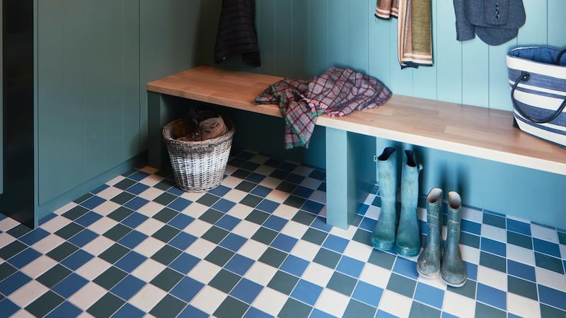
“Ruth was great; she encouraged me to be braver than I would have been on my own,” says Byrne. “For example, in the boot room I suggested a creamy pale grey but she reminded me of all the images I had given her: all the boot rooms I’d picked out had strong colours. I would have played it safe – so I took her advice and it is one of the things we get so many positive comments about from my friends.”
Kids’ personalities
The three children also had an input, with Luke wanting some orange and Cathal seeking lots of bookshelves. The rooms have been designed to keep working as the children grow older, with no “babyish” colours. “I always find kids get the most excited and it’s nice to able to work with their personalities,” says Noble. “On installation day, when the kids came home, their excitement was lovely.”
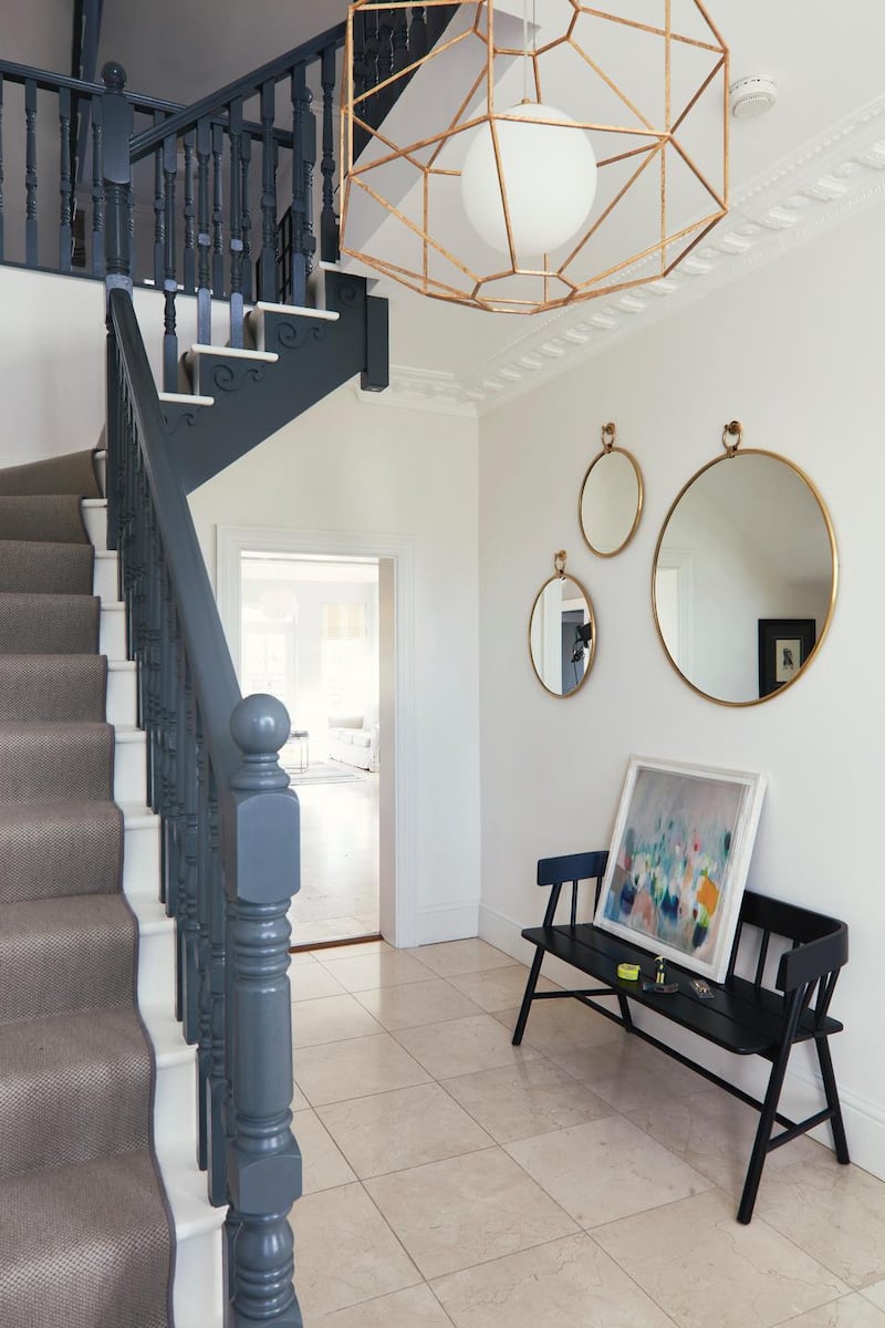
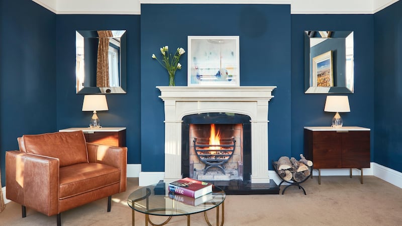
Along with the addition of more mid-century furniture, contemporary wallpaper (including one depicting tree bark), updated carpets, less traditional light-fittings, the bannisters were changed from wood stain to a dark grey. “That totally changed the feeling of the house, right from when you come in the front door,” says Byrne.
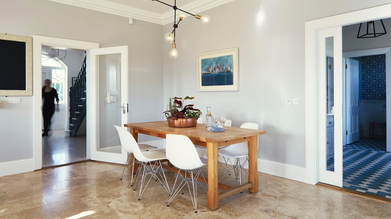
So that makes two dramatic entrances – front and back. “Now, you open the back door into a lovely bright entrance, a beautiful hallway and somewhere for all our coats,” says Byrne. “It is amazing the difference something like that can make.
“We now have plenty of storage and everything is in its place most of the time. I’m really, really happy with it.”
Ruth’s renovation tips
1 Live in the property, if possible, before doing a renovation to get a sense of how you operate within the spaces.
2 Identify where most natural light comes in to the home and explore ways to optimise that.
3 By having an overall, long-term plan for the property and its schemes, you will be able to approach the project on a phased basis, referring back to the original schemes when it comes to decision-making. This way you won't get side-tracked and there will be uniformity in the outcome and fewer errors along the way.
4 Trends can really influence decision-making but be comfortable with the selections and how they will sit with existing pieces, fittings and fixtures. Get a sense of your personal likes and dislikes with regard materials and colours.
5 Be brave with colour, research other projects and rooms on interior platforms and apps. Explore how colours have been applied in similar spaces and how they have been balanced by the lighting, flooring, textures and other elements in the room.
6 Don't be afraid to mix different styles of furniture or items from various periods; when well curated they can sit really well together.
7 Buy pieces that are versatile, for example, a chair or coffee table that will sit well in your sitting room but can easily be moved to maybe a TV room when required. Each room may have a different scheme but there should be a certain flow within the property which allows certain pieces to be moved into other rooms.


