Orla Kelly, designer and colour consultant
The colour that people find hardest to pick is a good neutral, by that I mean a colour somewhere between off white and stone.
I keep returning to Ivory Tusk from Colourtrend's Historic collection. It is deep enough to have character but it still has great warmth. It reminds me of those huge carved stones that are lying around the Forum in Rome, there is a vitality to their hue but also a patina aged by the sun and time. So this is a great reliable colour for any kind of room for the wall colour but it's also the colour I use often for woodwork – especially if I am using a rich colour on the walls. It's the steak dinner of colours: never disappoints, always works and suits many occasions.
Our love affair with grey goes on. My go-to grey, that is great for kitchen, dining or livingroom spaces, is Stirrup Steel by Colourtrend. It's a mid-grey so quite rich in chroma (or colour) but very warm as it has undertones of purples, not unlike those beautiful stones on the Beara peninsula in west Cork. It will give any living space warmth, character and a sense of sophistication.
I am quite besotted with the aqua or blue/green palette. These colours are not, as people sometimes mistakenly think, cold: in fact they are both warm and bright simultaneously. My favourite one is Blue Folly from Colourtrend's Historic collection. This is a truly calming colour and is perfect for bedrooms when something more interesting than white is desired. It is really half-way between blue and green but there is plenty of white in it which means that it has good light reflectiveness. It has very sophisticated light and shadow properties and can appear more blue or green depending on what type of light is hitting it. It can be used in a north- or south-facing room and works in bathrooms and bedrooms but is really great in kitchens too. Think translucent Croatian water lapping against white rocks and this colour is the one that will transport you there.
For a diningroom or bedroom, I often return to Dragonfly Wing by Colourtrend. This is a very rich blue (some would call it dark but it has undertones of reds and as such is warm) but in any kind of panelled room it is sublime and when any brass, copper or metallics are used to enhance it one is immediately transported to Paris. It is especially successful in rooms that have mahogany or larger scale furniture as it reduces the apparent size of bigger, darker pieces and gives the room a sense of unity. It is also a colour that I recommend for clients who want to paint the kitchen cupboards a rich blue colour although I find increasingly people are being brave and going for darker blues in this area. When a darker blue is called for I always use Colourtrend's Mussel, which is just as the name would suggest, a fabulous almost blue black but with a hint of green, when used in a gloss finish it is really rather elegant.
Philippa Buckley, interior designer, Studio 54
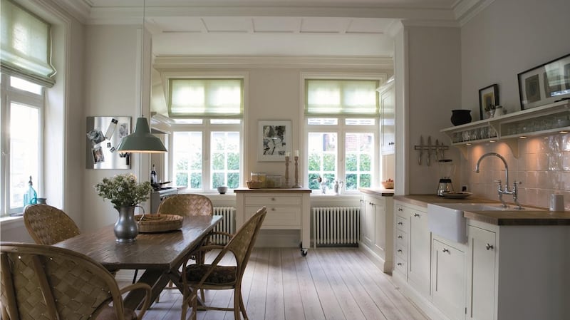
When I'm presented with a large open plan kitchen, work and living area, my failsafe scheme is to use a combination of Farrow & Ball Strong White No 2001, Purbeck Stone No 27 and Ammonite No 274. These varying whites and stone pallet create depth and warmth and can subtly zone off areas while sitting harmoniously with each other. The same shade of paint used in the various walls looks completely different due to natural light and the orientation of the rooms.

For kitchens, I love the look of a deep dark shade on cabinets, juxtaposed against cloudy white walls. For example, Dulux Indigo Blue on units offers a sharp relief to Farrow & Ball Strong White No 2001 on walls.
Natasha Rocca Devine, The Interiors NRD
For sitting room and hallways, Storm Grey by Dulux effortlessly adds luxury into any space, think of it as the interiors equivalent of a dark grey cashmere jumper. As it's a recessive colour (ie does not draw the eye), it's the perfect neutral to hang a cool painting, or place a bright couch or statement headboard up against. If you don't want to paint the entire room in it, one wall will add depth to a room.
For wood trim, Genesis by Colourtrend is a dusky and daring grey, that looks really sharp and modern when used on wood panelling skirting, doors or architraves. A few coats applied to an old table or dresser, is also an easy way to give dated furniture a new edgy look.

For bedrooms, Willow Tree by Dulux is a chic green tone which is muted enough so it's appropriate both short and long term. It's ideal for bedrooms as it gives a relaxing, calm air to the room, and has just the right ratio of grey undertones to prevent it looking too minty. It looks so crisp against fresh white linen and pops of teal and blue too.
Sinead Moore, creative director, Interiors Atelier
For kitchens, our team's current favourite colour at the moment is pink, especially Sanderson Coquette Light, a contemporary, very grown-up greyish pink.
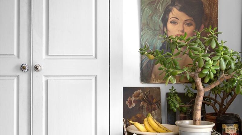
Used in a kitchen it works beautifully in both north- and south-facing room aspects. And although available in matt or gloss, I recommend an acrylic for the kitchen as it's really practical to clean. Partnered with a brown hue like Zoffany Pheasant in gloss, it delivers a stand-out, kitchen space.
Another great tip is to use soft pink on a bedroom ceiling, as it creates a dreamy mood and blissful sleeps. Designer Guild Palest Pink 133 in matt emulsion is a firm winner with all our clients.
Michelle Keane, Mibeau Interiors
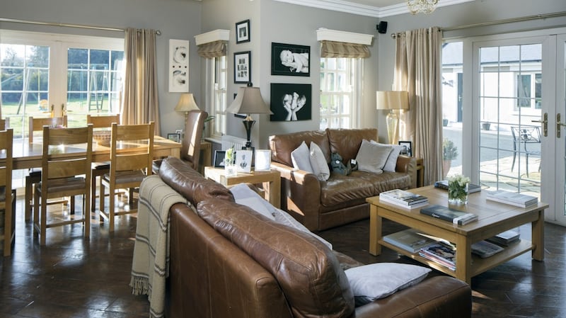
Designers Guild Portobello Grey 20 is a very smart evocative enduring grey for kitchens. I love this colour for kitchen walls as it's a warm grey with violet undertones, so works well against cream cabinets and dark wood furniture. The water-based eggshell finish is best for the kitchen as it can take a lot of hard knocks.
Colourtrend's Tumbled Marble is the one paint colour that always works for me no matter what room, or what type of house I'm designing. It's rich earthy cream, that instils a sense of calm and is a natural companion to pure white, matt black and just about every single shade of grey. It's a cult classic among designers and I simply can't imagine designing a home without it.
Patricia Wakley, interior designer and colour consultant at Fleetwood
If I'm presented with poor lighting or a north-facing room a great combination is Fleetwood Gray Morn and pops of Mimosa – a vibrant yellow, both from the Pantone collection. Gray Morn is a deep earthy greige that sits perfectly against raw wooden materials, and then you could paint a dresser, a table or book shelves in the rich yellow Mimosa to add a lovely vibrancy to the space.
Usually the loo is the smallest room in the house and logically you should paint them in light shades but I prefer to embrace the compactness and use a dramatic colour such as Fleetwood's Indigo Batik from the popular colour card. This rich denim blue creates a very moody look, but add in an oversized mirror and some bright tiling and it is very stylish and brave.
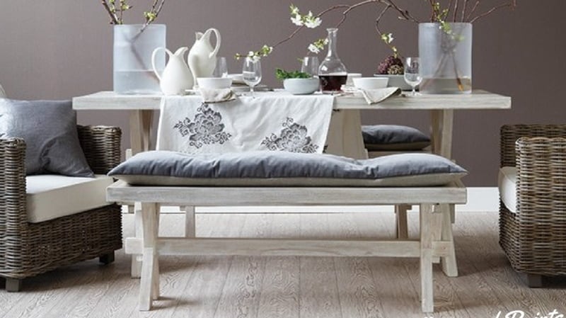
To give a feminine but not too childlike look in a bedroom, I love Fleetwood's Moonbeam as an alternative to traditional pinks and neutrals. This minky hue creates a soft, floaty ambience, making it suitable for any age group. If you are feeling brave, Fleetwood's Wild Mulberry, a soft orchid colour, gives quite a romantic feel to a master bedroom.
It can be used sparingly if the room is poorly lit and combined with white wood trims looks very sharp and regal.
Edel Nicholson, marketing director, Colourtrend
For outside, our colour team swear by Mucky Swan, from the Colourtrend Weather Collection – it's the perfect greige colour that exudes warmth even on the dullest day. It looks even smarter with classic white window sills and plinths and with a deep glossy berry paint on the hall door.
There's so many textures competing with each other in the kitchen from wood to stone, gloss to electrical appliances, tiles to metal accessories. So many of the interior designers we work with opt for Colourtrend Salter Stone – a soft mushroom base gives a gorgeous depth of colour without dominating the room.
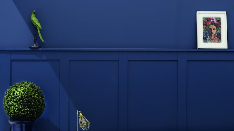
The bedroom is the one area in the house you can have some fun and Colourtrend Mussel, a rich deep blue, is becoming one of our most popular bedroom colours.
Blue tones are proven to have a calming effect and aid restful sleep and jewel shades are what all the leading designers are using in commercial and private projects too.


