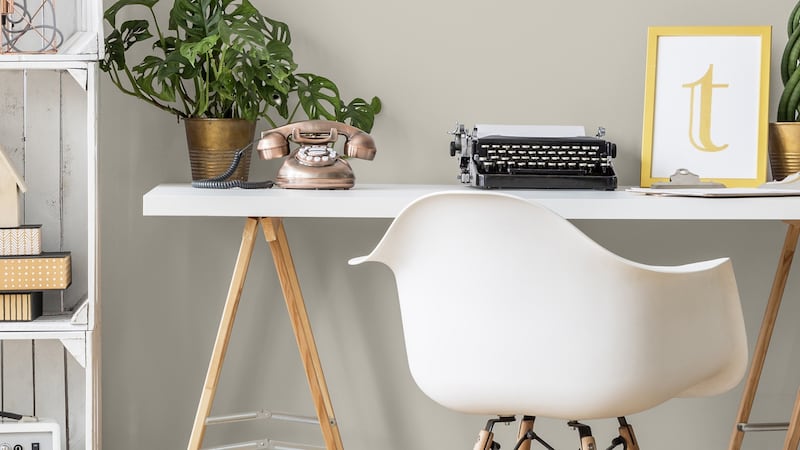
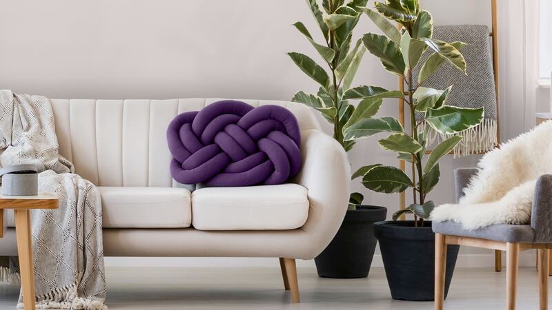
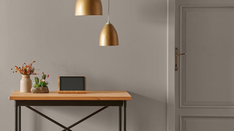
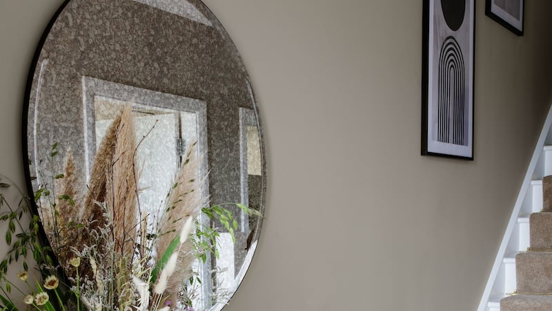
The Dulux colour of the year for 2021 is Brave Ground. Over at Pantone, they are hedging their bets with a combo of Ultimate Grey and Illuminating, which makes perfect sense. After all, Ultimate Grey does indeed capture the lockdown mood, but it hardly cheers one up. On the other hand, pitching the idea of cheery yellow (Illuminating) as bang on trend is a pitch too far.
As far as the Pantone copywriters were concerned, the pair were “a marriage of colour, conveying a message of strength and hopefulness that is both enduring and uplifting”.
But does anyone actually care? Is the arrival of a new colour of the year enough to make you paint out your Tranquil Dawn living room – so embarrassingly last year, don’t you know? – and resplatter the space with a burst of Brave Ground? And which is more important, the name or the colour of the latest paint?


When it comes to naming paint colours, Farrow & Ball appears to take the Biscuit (No 38 in its Archive Collection). From Dead Salmon to Elephant’s Breath – which may or may not be wafting in the air with Mole’s Breath – you can have a veritable zoo on your walls and woodcraft. But there are even stranger paint colour names out there. Take PPG’s Life Lesson (a pale sage green), the judicious use of which might perhaps have prevented you from indulging in Julie’s Dream (more like magnolia, from Little Greene), especially if armed with Colourtrend’s Covert Feather.
Irish paint company Colourtrend doesn't do colour of the year but it does launch 20-plus new shades each autumn. According to Rachel O'Connor, Colourtrend's managing director, names are chosen for the "emotive aspects of the hue" leading to Long Weekend, which "leaning to the green side of teal, is reminiscent of weekend trips to the seaside". Meanwhile, Sweet Jar and Iced Float "bring you back to your favourite childhood memory".


Anita Mullane, Colourtrend’s colour consultant, speaks of how colour can impact your mood, and also picks out new colours Batch Loaf and Unveiled as “soft, traditionally feminine hues that offer solace and comfort when used in a scheme”. Meanwhile, “greens like Silver Birch, Nettle Soup and Storehouse are rejuvenating and uplifting”. The names certainly are evocative, but can colour really do all that for you?
Colour consultant Adele Roche is convinced by the power of colour, but less so by its often ludicrous names.
“I was brutal at it,” she says of a brief sojourn on a paint-naming panel. “It can be really distracting,” she says. “Colour association is personal and cultural. I wore a royal blue uniform for my whole school career, so even though I love the colour, the associations put me off. A client might say they hate the colour green, and it might turn out that a teacher they didn’t get along with had a particular green jumper.”
She goes on to describe how our eyes receive light, and consequently colour, through rods and cones, which are different for everyone.
“If your rods are more sensitive to light, you’ll prefer darker colours. We all see colour differently, take Elephant’s Breath [Farrow & Ball]; some people see it as pinkey, some as beige, some as a grey.”
We ponder the name for a while, then she talks forgivingly about how hard it is to come up with a new name. Even when you do hit on one you like, you have to check another paint company isn’t using it.
“There’s a Little Greene colour called Mister David,” she says. “It’s yellow. Sometimes you think they’ve really run out of ideas.”
Just like people's personalities, what annoys one person, is fun for another
Roche gives colour courses to professionals, as well as to the public, including psychological insights into how different colours suit different personalities. Direct and engaging, she is also clearly tactful – for while she follows the idea of the four basic personality types (high achiever, relaxed, perfectionist and sensitive; or role model, average, self-centred and reserved, depending on your lexicon), she softens the pill a little with some creative naming of her own: Spring Morning (energetic), Summer Dream (more muted), Autumn Fire (earthy and warm) and Winter Star (with a preference for clean lines – yes, you know who you are).
“Just like people’s personalities,” she says, “what annoys one person, is fun for another.”
Meanwhile, marketing in colour, she warns, can tell us to want things we don’t want.
“Colour has to work for the way you see colour, as well as for your personality type. Trends only target one personality type per year, so when you go shopping and love everything, that’s because that year they’re targeting your type.”
This simple observation makes a lot of sense for those seasons where I look at the shops and loathe everything. It still doesn’t solve my more fundamental problem of how to choose a colour scheme to suit me when the Winter Star in my life is coming to visit.
Find information on Adele Roche's next colour courses at adeleroche.ie


