I love the trend for houseplants, but I don’t have green fingers!
Not since the 1970s have houseplants enjoyed such popularity, in part fuelled by gardenless urbanites hankering for the feeling of fingers in soil and a connection to the outdoors. However, many lack practical know-how when it comes to our green-leaved housemates, so tough, low-maintenance specimens such as ferns, monstera and all manner of desert plants – strikingly sculptural, (reasonably) tolerant of neglect and reassuringly difficult to kill – are both a sensible and a stylish choice.
Even if you choose “easy” plants, it’s important to get to know them: keep a note of their names, do a little research and save a list of the basic likes and dislikes of each, including their requirements for light, water and heat. It might surprise you to learn that over-watering is a far bigger culprit in houseplant-icide than being forgotten, so ensure that you check the moisture level in each pot before watering (try sticking a finger an inch or so into the soil; if it feels totally dry, the plant probably wants a drink).
Make sure there’s somewhere for that water to drain to: either pot the plant in a container with a drainage hole and a tray or saucer underneath, or, if you’re using a solid-based pot, place a layer of gravel in the bottom to help prevent the roots from rotting.
Use appropriate compost for the type of plant (succulents and cacti fare best in gritty compost, for example), and feed with a little fertiliser during the summer months, when your plants should perk up and start growing.
Tillandsia (commonly known as air plants), rather alien-looking beings that survive merely on water and air, can be a good starting point if you’re a total novice, as they require little more than a weekly bath in filtered water, and can be displayed in various creative ways.
The rosary vine or string of hearts (Ceropegia woodii), a trailing plant, is striking yet requires little care. If all else fails, try faking it with an artificial plant; there are some surprisingly convincing ones out there, and it’ll be our little secret.
I live in a new-build. How can I add character?
Owners of period properties with original features have a head start when it comes to decorating, with a fireplace that already demands to be the focal point of the room, or original Victorian tiling that naturally dictates the colour scheme. So it’s easy to feel overwhelmed when you’re confronted instead with a sterile beige box, with little to help you distinguish between the rooms, or even the floors.
Seek ways of creating your own focal points, instead, and add a careful balance of pieces in various styles and from different periods, to create the depth and soul that are missing.
An ostentatious marble fireplace in a one-bedroom flat built in 1993 is not the most sympathetic addition, but creating a focal point that isn’t the TV can make a living space more rounded in design terms.
A no-nonsense wood-burning stove will work a treat (or an electric equivalent, if installation of the necessary flue would be prohibitive), or use a striking sideboard or console table in the most prominent place, styled with your favourite vases or other objects.
Bringing in reclaimed materials adds soul instantly – cladding a wall with characterful old timbers, for example, or using reclaimed encaustic tiles to cover a kitchen floor and provide a charming contrast with contemporary units.
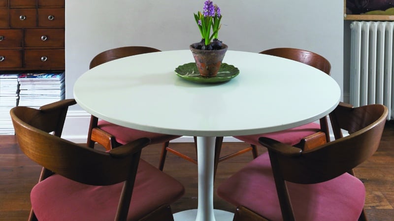
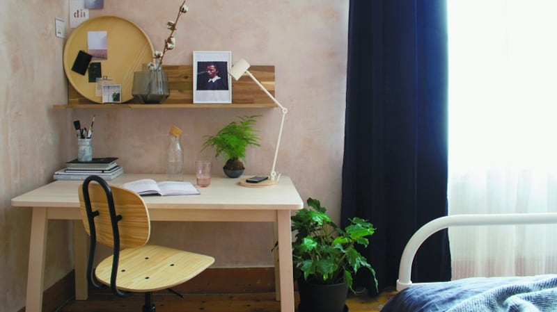
You can get the same effect with vintage furniture: a dining table with a roughed-up lime-washed top will instantly add personality, or try placing a charming wingback armchair to one side of a modern sofa.
Your space will presumably have come with all walls painted a tasteful, inoffensive shade of bland, so breaking things up with a new scheme, or even just a few tonal hues thrown in here and there, will help to give each room its own identity.
Choosing heritage hues with a flat matt finish can help to lessen the “newness” of everything more than vibrant, contemporary shades might. Texture, too, will instantly add interest: try throwing down a few chunky woven rugs over that beige carpet or cheap laminate, or even ripping up the flooring and going with the bare concrete or utilitarian wood sub-floor, for an industrial twist.
How can I customise my chain-store kitchen cabinets?
If you’re not in a position to change your kitchen, or are after a quick fix to tide you over before refitting the space completely, you can drastically change its appearance without expending much time or money.
Painting the cabinets is a good first step, and can give dated wooden doors a contemporary look, as well as providing an opportunity to introduce colour. Most standard kitchen units are constructed from engineered wood particleboard with a melamine veneer, leading many people to believe that they can’t be painted, but with the right primer and paint, even high-gloss doors can be transformed.
If you’re feeling adventurous, consider cladding your cupboard doors. This is most easily done if they don’t have mouldings. Visit your local builders’ merchant and get thin wooden boards cut to the same size as your existing doors, then fix them in place with wood glue. Get experimental and try using pegboard, oriented strand board (OSB) or plywood for a contemporary look, finishing with a clear waterproof varnish for practicality.
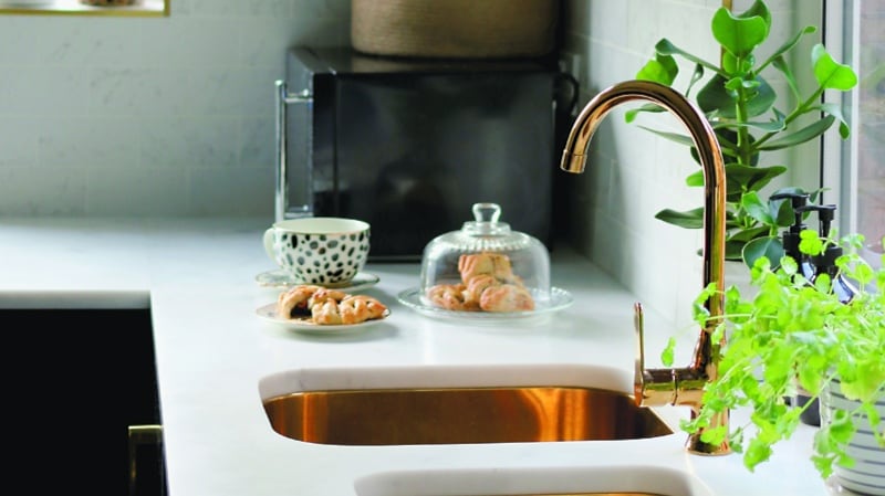
If that’s scared you off completely, get in touch with a company that specialises in replacement cupboard doors, and simply change old for new while retaining the original cupboard carcasses.
Another antidote to the chain-store blah is to add something bespoke. This needn’t mean splashing the cash on custom carpentry, as personalisation can come in many forms. You could remove the doors from the wall cupboards altogether to create open shelving, adding decorative wallpaper to the backs of the cupboards for a splash of pattern. Or mix things up with shelving made from reclaimed wood to contrast with your contemporary cabinets.
An unexpected element, such as a vintage ladder used to suspend plants or pots and pans, can be enough to distract from basic cabinetry and create an individual look. Finally, don’t overlook the importance of great door handles, which really
Is it possible to create a tasteful children’s room?
Kids’ rooms can be a place where you can really let your (I mean, their) hair down and have a little fun with the design, so, rather than writing them off as taste-free zones destined to feature only dog-eared posters of boy bands and naff tractor or princess motifs, embrace the bold, fun patterns and hues they can take and allow everyone’s imagination to run wild. Making the space broadly gender-neutral is a practical way of accommodating ever-changing little tastes, as well as giving them an unrestricted space where they can play as they please.
As is so often the case with design, if you’re after something clean and contemporary yet effortlessly chic, be inspired by Scandinavian styling: think cool geometric monochromes, simple star motifs and pops of colour. Any bold patterns are best kept to a monochrome or single-tone palette, saving vibrant rainbow hues for accent pieces, to avoid the space becoming too busy and distracting the child from sleeping.
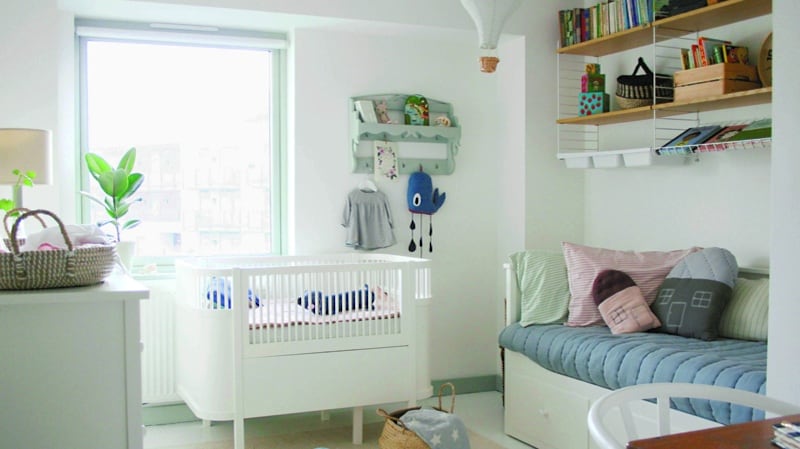
On the other hand, if ever there were a room where you could get away with theming without it appearing cheesy, it’s here. Think creatively: a “jungle safari” theme could play out with some on-trend monstera-leaf wallpaper, a (fake) animal-hide rug, a play teepee, pot plants (avoid spiky cacti, for obvious reasons) and a cute rattan bed, complete with mosquito net if you really want to go for it.
For practicality, use a hardwearing, wipe-clean paint for walls, or even add an interactive element by coating a wall in chalkboard paint, as a mini artist’s space for any budding Picasso.
Make sure there’s a good mix of storage and display space, to hide away all the ugly plastic toys and put the pretty ones out on show. Displaying cute book covers on picture ledges can act as decor as well as encourage reading, for a double win. Keep in mind, of course, that aspiring to have a “big girl/boy’s space” can be a real selling point for little ones, so don’t be afraid to steer them gently towards your way of thinking by declaring that anything truly naff is “a bit babyish”. We won’t tell.
How do I arrange my ornaments to look curated?
While ornaments may be instrumental in helping a house feel like a home, they can simply feel like clutter if they’re not handled with care. A solitary line-up of unrelated (or even perfectly coordinated) pieces can feel sad and spartan, so think in terms of three-dimensional curations rather than simply running things along a few edges.
A symmetrical scheme can be restful for the eye, but requires careful configuration and can feel staged, so it’s better to work with odd numbers and varying heights. Our brains respond naturally to arrangements that obey these rules, forcing our eyes to move up, along and around in order to take everything in, so such groupings are – unsurprisingly – more visually interesting.
As well as bearing in mind the Rule of Odds, make sure there’s enough space between the groupings, so the eye is not overwhelmed. Working with vignettes of objects from a similar “family” – whether quite literally multiples of single items (a cluster of pillar candles, say) or more casual acquaintances (such as a collection of otherwise unrelated trinkets all made from natural materials) – can be a good approach to begin with.
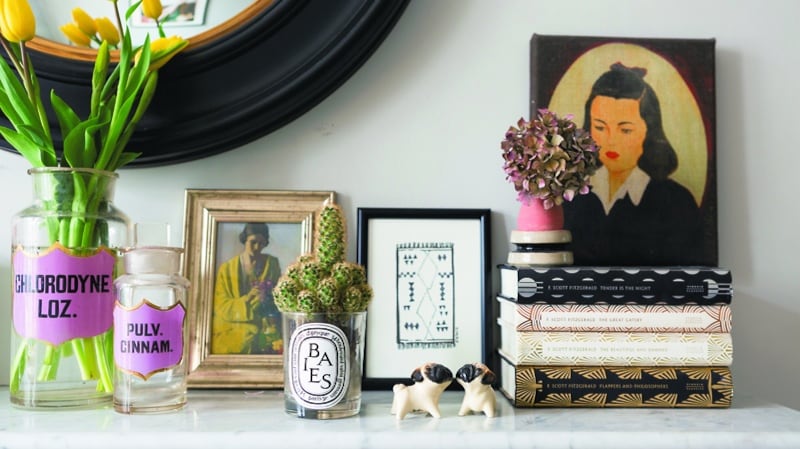
A difference in silhouette is paramount for this, so consider the shape of the pieces as well. With a set of vases, for instance, a mixture of geometric, curved and rounded shapes will have more impact than a group with similar proportions. Introducing smaller, subtler pieces can help things to feel fuller, and they won’t vie for attention with your primary display pieces.
This rule can also be applied to wall-hanging objects, such as artwork. A painting or print hung off-centre a little way above your arrangement can ground the grouping. Consider practical elements, too: books stacked on a coffee table, or a bedside display that incorporates a lamp, plant, alarm clock, mug and pretty tube of hand cream. Finally, though, don’t feel obliged to adhere so rigidly to any of the above that you’re forced to discard much-loved items: above all else, if it makes you happy, roll with it.
How do I know when I’m done?
Goals are important, of course, but the process of decorating one’s home is rarely straightforward, and as soon as something seems “complete”, our needs change: a burst pipe necessitates a quick mini-renovation, or we suddenly realise that we hate our living-room curtains and won’t rest until they are replaced. Try instead to embrace the process and accept that it will grow and evolve along with you, rather than being a linear path with a defined beginning and end. It can be helpful to break things down into short-, mid- and long-term goals, allowing the more pressing tasks, such as getting the plumber in to sort out that leaking tap, to take precedence over the “someday” wistful projects, such as extending the loft.
Remember that “done” doesn’t necessarily mean perfect. There will always be something that you wish you could change. When looking at images of beautiful rooms online or in books, remember that you are seeing an edited representation of real life, leaving out the realism of that pile of ironing in the corner, or the sea of toys just out of shot.
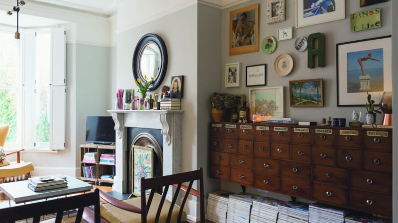
In fact, when selecting images for this piece, we were careful to keep things balanced and show a selection of “real” homes alongside places that had been professionally designed and photographed. Don’t feel pressurised into changing any of your decor because of a shift in trends, either: if you still love it, embrace it (it’ll come back round again sooner or later, anyway).
Changing your mindset so that you think of your space as more of a hobby, particularly if you find yourself becoming keen on interior design, can have benefits for both your home and your general wellbeing.
Revel in the creative process of transforming that tired old coffee table into a thing of beauty, or of picking up a set of beautiful glass decanters at a vintage fair and styling them on your sideboard. Embrace an ever-growing collection of houseplants breathing life into your space, and proudly display those life-affirming mementos as you accrue them, regardless of whether they match your designated colour scheme, but simply because you love them.


