I’m not really a believer in new year’s resolutions, especially those that restrict or deny, but I do love the feeling of a fresh start; that anything is possible and things are moving forward.
So what better way to start the new year than to give your home a good clear-out. Think of it like a detox for your house. Tidying away the Christmas decorations is a great time to assess what really should go to give your home a whole new lease of life.
Spending time at home really gives us a great opportunity to see what’s working and what’s not, and to make the changes to the things that bother you most. Resist the temptation to put things off for fear of having to undo them when you eventually get round to do the aspirational big project.

So often I go into homes where time has stood still for this very reason – and when the client is in a position to do the big job they realise that they don’t need to anymore because their family has moved on and their requirements have changed.
So chip away at the little things that bug you – this is a great way to stop problems getting out of control and too big so that you feel overwhelmed by the thought of sorting them out.
A perfect example of this is my kitchen, which is a room that has been in a constant state of evolution since we moved into the house. We simply didn’t have the budget to tackle it in as grand a way as I would like. So instead each year I’ve adjusted and tweaked it to suit our needs.
It is a small galley-style kitchen with dining space at one end. The dining table was too large and, as a result, most of the chairs were unusable. Even though this was the room everyone gravitated towards, it was not a great space to hang out in.
The room looked onto the garden but had no external door. The first change was to turn the window beside the dining table into a set of doors. The transformation was dramatic and it also gave the space outside the doors a new lease of life as it now functioned as an outdoor seating area where guests could sit on a fine day and still interact with those inside.
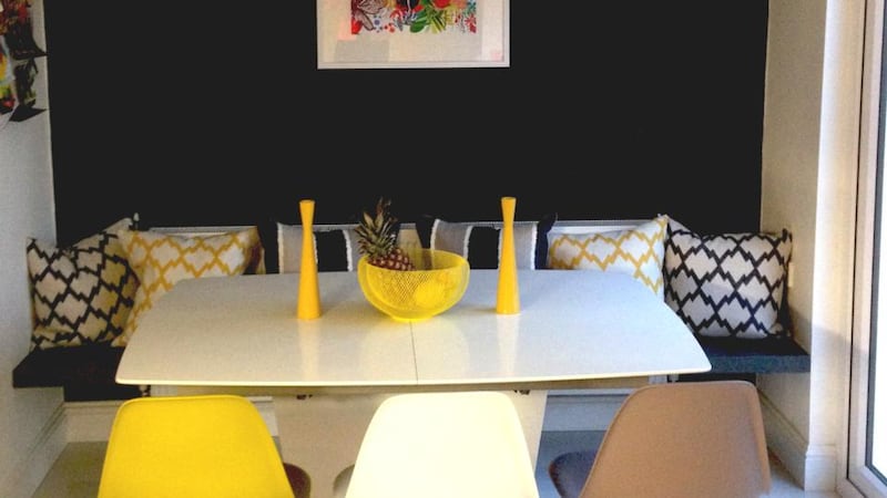
However, the increased light from the double doors meant the white walls were looking a bit stark – the kitchen needed depth. This was addressed by painting the wall by the dining table a very dark grey. This did two things: it defined the dining space, giving the room focus and it dampened the glare which was always an issue as the room is south-facing.
The next bone of contention was the dining furniture which really wasn’t working. We installed a bench along the back wall for seating and introduced some cushions.
The dining table was switched for a pedestal table, which made accessing the bench seat much easier; the table also extends giving us options for entertaining.
Finally, I replaced the chairs with three coloured dining chairs, pulling the new and existing colours together. Dare I say it: I think I might be happy with it now.
Denise O'Connor is an architect and design consultant


