With space at a premium for most of us, the idea of a kitchen the size of a roller rink is becoming a thing of the past.
Post-pandemic, the need for separate spaces and rooms with doors has become a requisite for multi-person homes. The new kitchen design thinking has fallen out of love with open-plan layouts in favour of some division between cooking and eating areas.
Mark Grehan is an advocate of this new thinking. He set up the fragrant flower shop, The Garden, in the entrance hall of Powerscourt Townhouse, Dublin 2, and used its front steps as his shop window, with plants and blooms staggered all the way down the granite-hewn steps.
His fresh approach to floristry has seen the independent business thrive, and he has since opened a second space in Dublin 8. It includes a studio space where you can watch the team in action preparing florals for high-end weddings and tablescapes that have appeared in Vogue magazine.
READ MORE
The garden designer and retailer bought his top floor, two-bedroom Dublin 8 apartment about 15 years ago, and decided recently to change its layout.
He had an open-plan kitchen/living space with a long line of units running the entire length of one of its walls. It broke up the room as well as its flooring. All in, it took up about 12sq m of space. He’d had enough.
“I’d looked at the kitchen for 15 years and didn’t want to be looking at it any longer,” he says.
One solution would have been to turn the sofa to face the other way, but then he would have been looking at the neighbouring units – which he also didn’t want to do.
Instead, he reviewed the floor plan. On paper the apartment measured 86sq m (926sq ft), a good size for a two-bedroom unit.
[ ‘My city roof terrace saved me in lockdown’Opens in new window ]
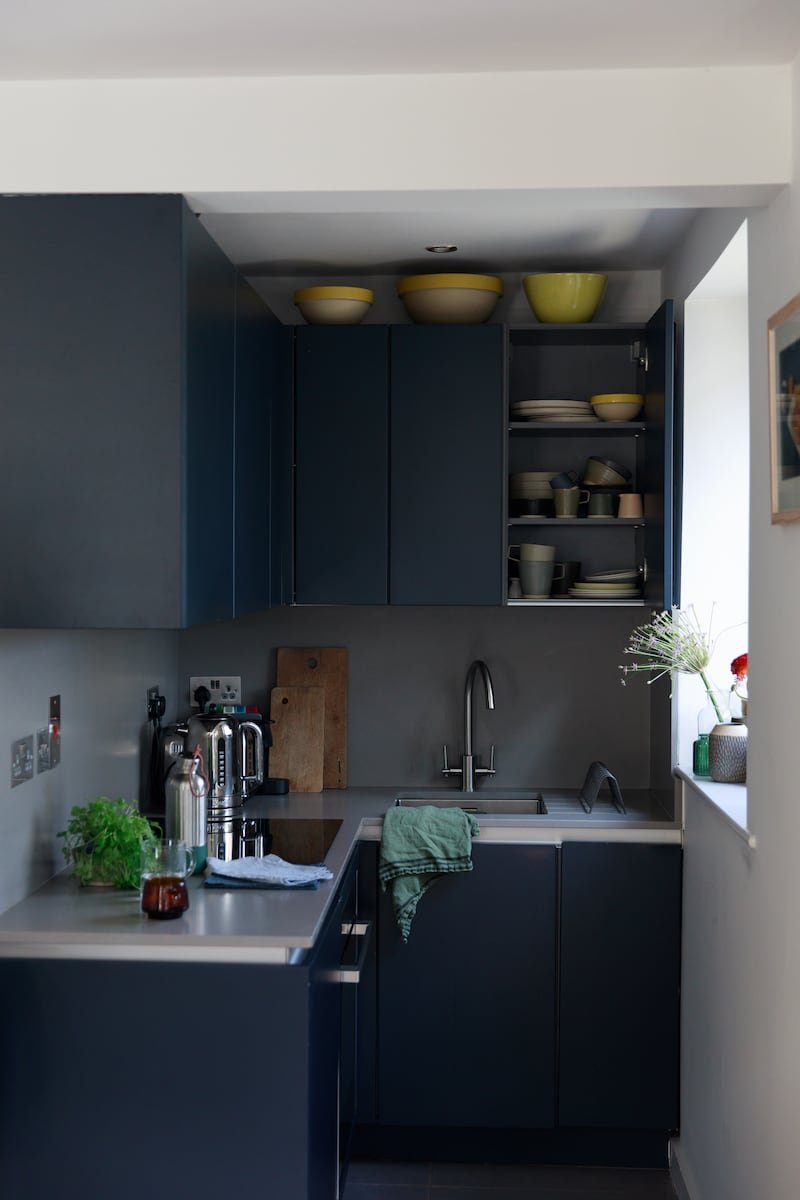
By subtracting space from the adjoining bathroom, he was able to carve out a nook off the livingroom in which to install the kitchen, where it would be out of sight. It also gave the nook natural light – essential in a kitchen. By removing the bath, the former bathroom became a wet room.
However, the space Grehan gained was only half the size of the original kitchen. It measured 6.4sq m (1.9m x1.42m), so he realised he had more decluttering to do. Much of his existing kitchen kit had to go. He got rid of the microwave and the capsule coffee maker, both of which were taking up valuable countertop real estate.

In his original set-up, he had a separate under-counter fridge and freezer. The freezer was rehomed in the utility room, a space he was lucky enough to have. It also reduced ambient noise in the living space. The dishwasher was also sacrificed.
The scullery-style design by Kube, in a French navy shade, creates a dark and moody space that contrasts with the blonde Scandi wood tones of his living space.
[ The Dublin couple who built their house in a weekOpens in new window ]
Now the sink is on the outside wall at the foot of the L-shaped space. Two cabinets and open shelving are above. His crockery fits in the latter. There is stemware in one and pots and pans in the corner unit, where they are stacked carefully.
Below the counter there is now a deep three-tiered drawer where the dishwasher once lived. It fits cutlery up top, utensils in the middle drawer and cleaning products in the bottom.
To its left is his segregated bin unit, all separated for recycling. His compost goes directly on to the plants and herbs that decorate his rooftop terrace. This is where he also grows fragrant herbs such thyme and rosemary.
Above the induction hob is a new extractor fan. Concealed within it is a shallow space to store spices out of sight.
Below-counter and ideal for small spaces is the Neff Hide and Slide oven, with a door that slides back into the unit, a space-saving hack that comes into its own where floor space is at a premium, says kitchen designer Terry Plunkett, director at Kube Rathgar.
Next to it is a voluminous under-counter fridge, big enough to house all Grehan’s fruit and vegetables, where they’re kept in a crisper to keep them fresh.
He doesn’t miss the microwave, preferring to make his porridge on the hob the traditional way. “Removing the countertop capsule coffee machine means there’s less waste and visual clutter,” Grehan says. He now uses a drip design.
Any regrets? “Probably the dishwasher,” he says. When he has guests, after doing all the cooking he is left to do the washing up.
But the upside is a more delineated space. “I’ve enough [space] for me,” says Grehan. “I find I still stand in the kitchen and drink coffee at breakfast and sometimes have a glass of wine while cooking.” He also batch-cooks, he says, to cut down on kitchen duty.
While small, his kitchen is perfectly formed for Grehan’s needs. “Best of all, you can hide the mess when entertaining,” he laughs.
Design tips for small kitchens
Double-duty appliances
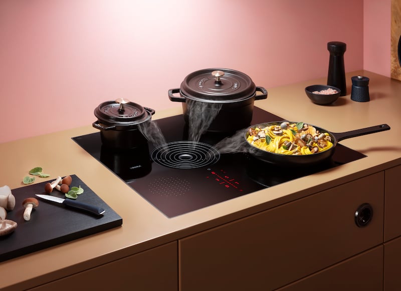
When space is limited Séan Turley, designer at Arena Kitchens, suggests installing a Bora S Pure, a five-ring induction hob with a built-in under-counter extractor, which will free up overhead space for another wall unit. Prices start from €2,365.

The kitchen sink
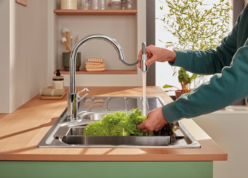
Accessories for Grohe sinks allow you to free up space – such as those for its new PVD sinks, including chopping boards, dish racks, silicone draining boards and multifunctional colanders that can easily be placed on top of the sink, turning the area into a prep station.

Hang up
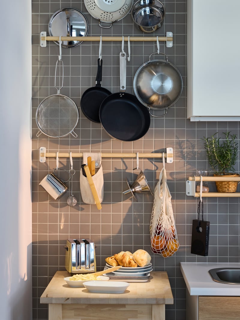
Free up workspace by hanging pots, pans and utensils using the birch wood and unbleached hemp and cotton look of Ikea’s Nereby rails, priced from €5, and hooks from €2.

- Sign up for push alerts and have the best news, analysis and comment delivered directly to your phone
- Join The Irish Times on WhatsApp and stay up to date
- Listen to our Inside Politics podcast for the best political chat and analysis


