Nature, sustainability and technology are some of the top influences on interior design trends for this year, while simple neutrals are being eschewed in favour of more considered choices, including sunny Mediterranean colours, warm spicy shades or the bold drama of black.
Sara Cosgrove, an interior designer and a judge on RTÉ’s Home of the Year, is enthusiastic about sourcing sustainably and cannot wait to show off some stunning terrazzo tile samples, as a great example. “It’s a composite made from the off cuts of the tile and marble industry, so it’s a great material in terms of using waste product and turning it into something new,” Cosgrove says.
For cute children’s furniture, Cosgrove namechecks Ecobirdy – a company which recycles discarded plastic toys and turns them into hard-wearing design furniture that is comfortable to use and easy to clean.

Meanwhile, on the tech front, Tracy Gordon, assistant product and marketing manager in Harvey Norman’s white goods division predicts this will be the year smart and connected appliances really come to the fore across all home appliance categories. “It’s a real value add to the customer,” Gordan says.
READ MORE
The heart of the home
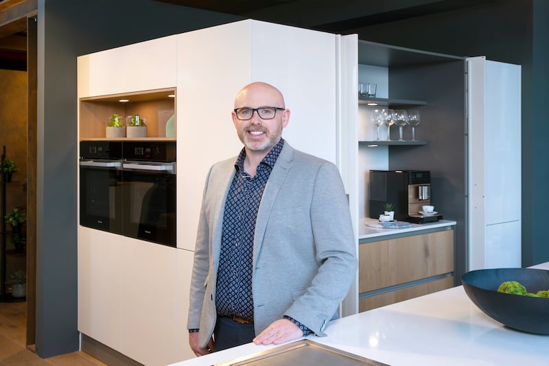
If you are thinking of a kitchen update this year, Dave Fagan of Kube Kitchens recommends a chic and timeless black-green colour. “Dark greens add warmth to a kitchen and are an easy, soothing palette to live with. They also complement timber finishes on breakfast bars, shelving, and islands particularly well,” Fagan says.

This season sees the introduction of natural stone worktops in dark grey and black. “This is a braver choice and is more likely to be chosen by design-savvy customers and those who have been introduced to it by an interior designer,” Fagan notes.
“These dark worktops create drama and sophistication in the kitchen, while black is timeless and will work with any other colour in the room.”
In kitchen appliances, the industrial look of stainless steel is declining in popularity in favour of more intentional colour decisions.
“Grey is the colour of choice at the moment,” Gordon has noticed among Harvey Norman customers, while the shade may vary depending on the product, “graphite type grey for laundry and cooking appliances, black or dark steel for refrigeration.”
On the other hand, if you enjoy a touch of kitsch in the kitchen, look to the vibrant Sicilian setting of season two of The White Lotus for your interior inspiration.
For anyone who has already bagged themselves one of the gloriously OTT kettles or toasters from the Smeg x Dolce e Gabbana collaboration and wants to expand on the theme, there are now plenty of options for mood-boosting summery shades.
“We have a range of colours now on offer in our range cooker models that will make a statement in any kitchen,” says Gordon. “The Smeg Portofino range is inspired by the hues of the Italian town including olive, orange, yellow and red from the buildings lining the shore, and a beautiful turquoise representing the blue waters of the Mediterranean.”
Rangemaster has also got in on the trend, with cooker options in a mineral green and China blue that have already proven popular with Harvey Norman customers.
The humble utility room
With the prevalence of open plan layouts, kitchen-dining-living rooms have to be stylish and multifunctional living spaces, where all the living and entertaining happens. The humble utility room has really come into its own as the place to hide all the clutter and laundry you do not want the guests to see.
“New solutions are being designed all the time for utility rooms in order to make laundry and storage easier,” says Fagan. “Laundry chutes are now very popular along with pull-out laundry baskets for sorting.”
In a fully kitted out utility expect to see the washing machine and dryer at eye level, long cupboards for storing coats and jackets with shoe holder inserts on doors and shelving, and perhaps even a raised dog bath for families with pets.
Comfort and cosiness
In the livingroom, cosy and comfortable is the order of the day. Gerard Crofts, managing director of The Sofa Factory, points to the evidence: scatter cushion sizes are getting bigger and bigger, and footstools and ottomans are taking the place of coffee tables – perfect for putting your feet up. Texture adds another sensory layer. “Bouclé fabrics are very in vogue at the moment,” says Crofts.

The Sofa Factory make all sofas, headboards and reupholstery jobs to order; Crofts pinpoints the popular colours for this year being earthy tones of pinks, spice colours, tans and rusts. These shades are easy to live with, colourful but not too bright, bringing a feeling of warmth and groundedness, creating a relaxing ambience.
All of these shades sit beautifully against a warm neutral. Dulux’s paint colour of the year, Wild Wonder, billed as “a glowing natural tone that offers us a connection with nature and that brings a sense of natural magic into our homes” would make the ideal backdrop.
Cosgrove is relieved to see more colour and individuality coming into play in a more balanced way, after a phase of two extremes – bold maximalism or bland neutrals.
“Where we’re at in this moment is a softer, more colourful and playful place. A trend that started during Covid, of reconnection to nature, is definitely continuing,” Cosgrove says. Regardless of the colour, tones are likely to be “diffuse” and paired with what she terms “honest materials”.
People are frequently choosing to make sustainable choices and revamp treasured old chairs or couches, as Crofts attests, with The Sofa Factory doing a busy trade in taking on vintage and antique pieces, especially chairs, to be renovated and French polished.
The hotel experience at home
The trend for luxury hotel-inspired bedrooms seems to be here to stay, according to Cosgrove. “When we’re in a hotel briefing meeting they often say, ‘We want this to feel like home for our guests,’ and then when I’m sitting down with a private client, they say ‘I really want my bedroom suite to feel like a hotel’,” Cosgrove explains.
It is the finishing touches and attention to details that define that hotel feel; plush textures, occasional furniture such as an armchair or a chaise longue, and well-chosen mood lighting.
Wallpaper is an easy way to create a statement and where once it was relegated to the downstairs toilet or one feature wall, people are becoming braver in their choices. Cosgrove is a big fan, and often uses hand-painted wallpaper for private clients. “I think paint is powerful but if you really want to create texture and depth in an interior, wallpaper does a lot,” she says.
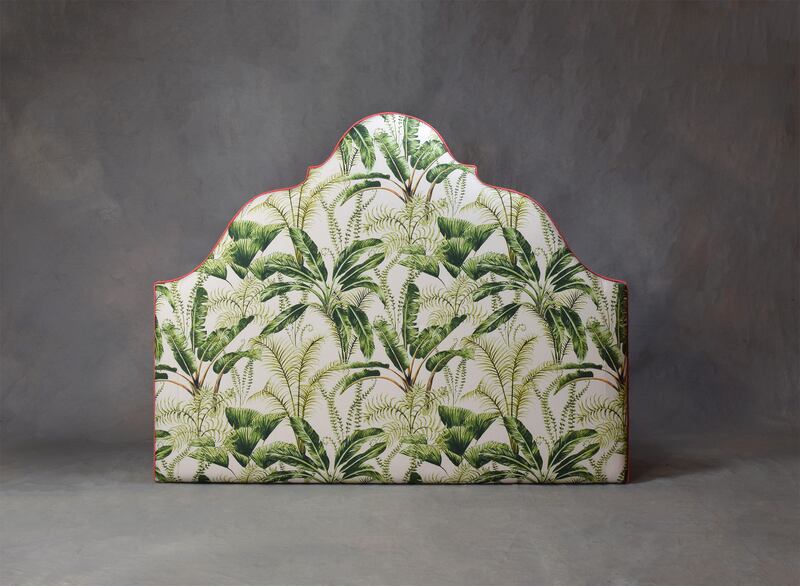
At The Sofa Factory, Crofts is seeing impactful design decisions being made in upholstery fabric for headboards, with a lot of large bold florals and statement shapes such as curved wing or regal style headboards. Meanwhile for bed bases, plain upholstery remains the most popular choice.

If you find yourself struggling to choose or keep to a defined look or aesthetic, Cosgrove has one final tip to help keep your inner design magpie in check: “Make a Pinterest board, challenge yourself to filter it down to six or seven key images, then print it out and stick it on your fridge or keep it in your wallet, as a talisman for the project. It’s a great way to stay on track and not get distracted.”


