In a world teeming with off-white bedrooms, greige kitchens and minimalist interiors, Elaine Verdon is a colour advocate. “There’s nothing wrong with neutrals,” she says, “But why not bring in a little warmth, texture and contrast? Colour has the power to transform a space and our moods. That’s what excites me.”
As an interior designer and founder of Dublin-based design studio Leo and Cici, Elaine is a proponent of exploring the full spectrum of self-expression through living spaces. Scrolling through her Instagram feed is a visual delight; a Wizard of Oz-green bathroom in wallpaper and tile, sumptuously upholstered armchairs in rich patterned prints, a children’s bedroom adorned in rainbow motifs with powder pink blinds. Her style is a masterclass in technicolour sophistication.
Since founding her design company, named lovingly after her maternal grandparents, in 2018, Elaine has been helping residential and commercial property owners identify their aesthetic grooves. “To approach a space, you need to understand the person who lives in it. By uncovering little nuggets of insight, family photos or a favourite artwork, for instance, you find out how they want to feel in a space. It’s like putting a puzzle together.”
It’s an approach she’s applied to a personal project, too. “My husband, Simon, is from Roscommon,” Elaine explains. “In the early 2000s, his aunt Mary built a bungalow five minutes from the family farm. She sadly passed away in 2017 and, to our great surprise, she left us her home.”
READ MORE
To create a space that reflects Aunt Mary and us has been the goal. Now when we open the front door, we feel it.
The property has become a respite for the family of three and a place she says her son Arthur, aged 5, has a special bond with. “He calls it the red house because of its russet front door and garage,” she laughs. “The front door had been installed by Mary. The bungalow has become our weekend retreat and a gorgeous place for us to hang out in. It’s a haven of cosiness and privacy and nothing but green fields and trees when you look outside.”

Elaine wanted to retain the emotional connection the family has to their Roscommon abode, while also staying true to her own love of strong hues. “Everything I’ve added to the house has been sympathetic to Mary,” Elaine shares. “She loved red and adored flowers so I’ve tried to bring those elements into the house. While there are photos of her in the kitchen and sittingroom, I wanted her to be in the space in a decorative way.”
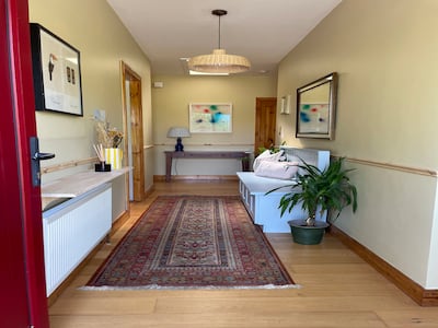
An area that had remained untouched, however, was the entrance hall. “In the country, everyone uses the backdoor as an entry, which, growing up in a city, is something I had never experienced before,” she laughs. “It means that we haven’t used the hallway. It’s been the last space to get overhauled.”
It’s also a tricky enough layout, typical of its vintage. North facing and quite dark, with just a little light coming through a handful of skylights and the side panels on the front door, it is t-shaped with a large internal section and many doors opening off it. “For me, it needed to become a space that felt warm and inviting, one that welcome guests when they first arrive – on the rare occasions that they would enter through the front door.”
All in all, save the new composite front door Mary had installed to keep out the draughts, the space was a little flat and not in keeping with her reimagining of the other rooms. She opted for a very brave colour combination. “Paint is the single most transformative and cost-effective tool when decorating,” she explains. “I’ve used the Dulux Heritage range for Leo and Cici projects and I love its timeless luxury palette, the quality of the finish and the fact that each colour is steeped in research and inspired by history. Classics with a modern twist you can choose between chalky tones or statement shades.”

The space had an engineered floor with lots of natural timber in evidence on its many four-panel doors and skirting. It was also modest in size and scale. No soaring period ceiling heights to play with here. And, how could you make that number of doors look visually interesting?
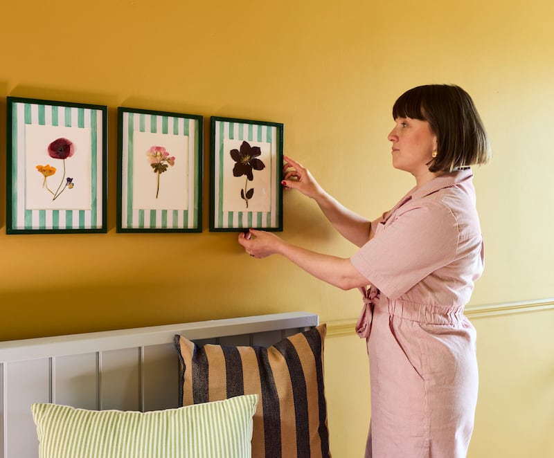
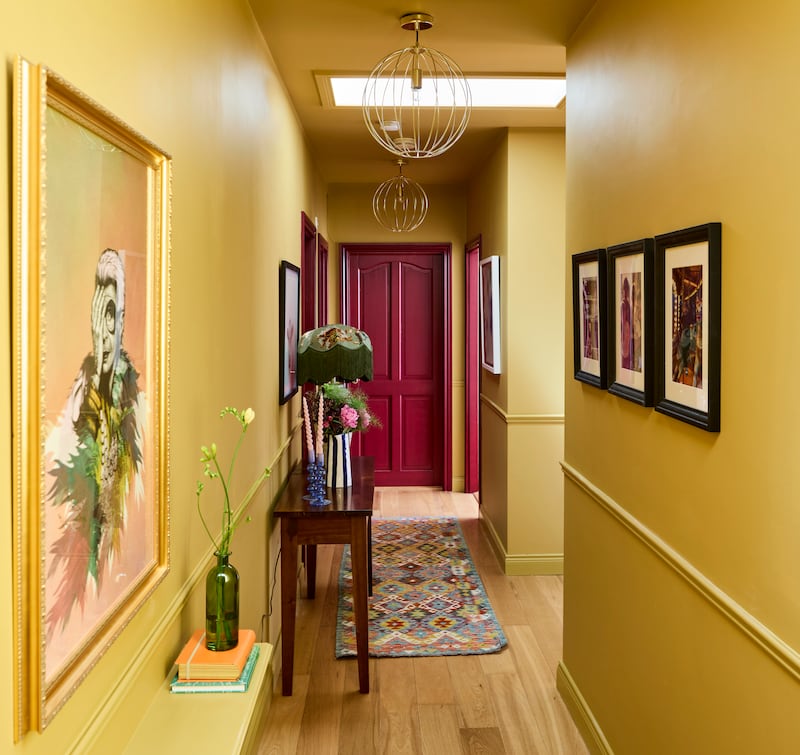
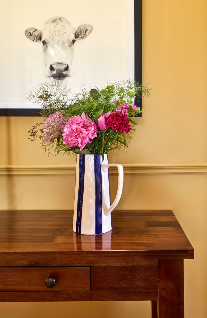
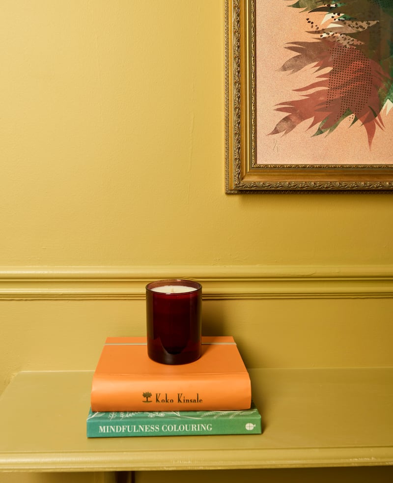
By turning the colour up to 11, she explains. “I decided on Brushed Gold, a soft antique yellow, for the walls, ceilings and skirting boards to give an almost sunshine-filled colour drench to the space. This was offset with the use of an intense Florentine Red on the woodwork as our nod to Mary. She would have loved it.”
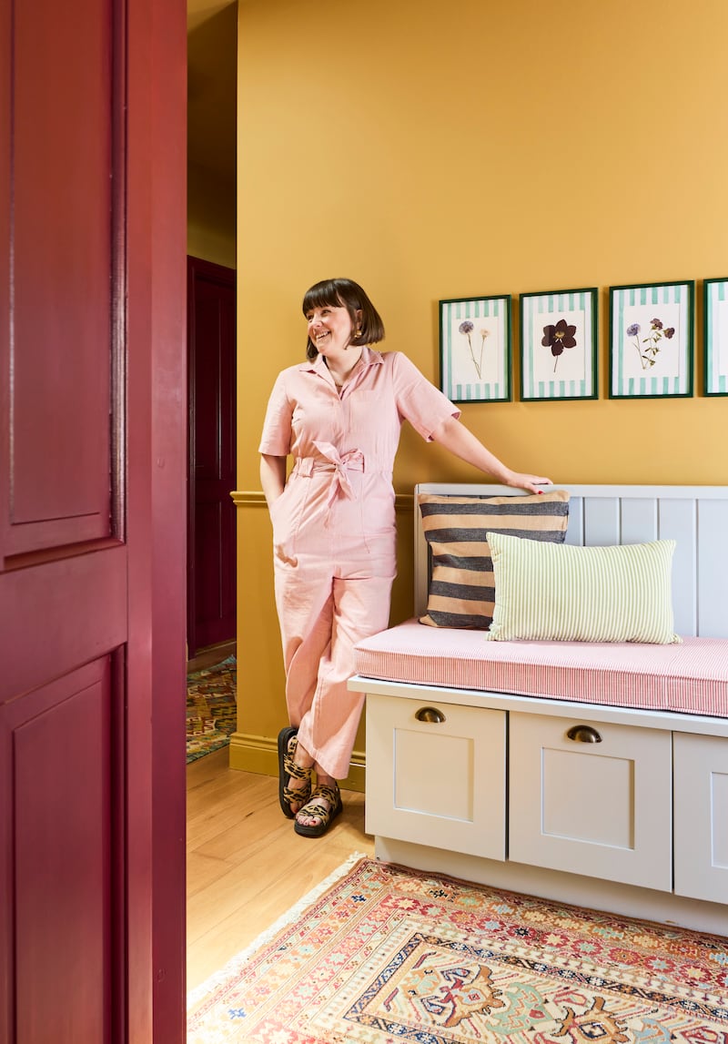
When painting with the primary colour red, a perfect pigment-rich finish was achieved on all doors. “It’s so vibrant and so us,” Elaine beams.
A dado rail was also added, a nifty design hack for those living in similar-style homes. Not only does it protect paintwork but it also provides a point of interest in long stretches of wall space. It, too, was drenched in Brushed Gold.
Designed using rich pigments, the Dulux Heritage range is grouped into tones that contrast or complement each other to help you make choices that will work harmoniously together.
You can play with ideas online at the Dulux Heritage website, where you can select your paint by tonal palettes or by colour group. If you’d prefer to get an informed, second opinion then book an online consultation with a Dulux Heritage colour consultant. Free of charge, the Dulux team can help you choose colour for your home or project with confidence.
Once the paint transformation was completed, the space still needed dressing to integrate it into the overall look of the house. An oversized lamp now wears a jazz-age fringed shade, a House of Hackney design by Dubliner Frieda Gormley. Underfoot, the practical engineered floor has been covered in punchily patterned runners, sourced from Cork-based Rugs.ie. A bench has been repainted in Dulux Heritage’s Country Sky, a soft blue that Elaine fell in love with and that she has also used in her kitchen. Artworks and family photos adorn the inner walls and an antique mirror helps reflect light into the outer hall.
Lighting is also key. Judiciously chosen pendants from Pieces.ie create pattern play on the ceilings and amp up the house’s cottage core credentials. “These add warmth, especially in the winter and evening time. It’s the visualisation of the cosy, warm feeling we experience when we stay here.”
For Elaine and Simon, the hallway’s redesign is their love language – a personal commitment to this special place. “We consider ourselves the custodians and gatekeepers of Mary’s home,” Elaine says. “To create a space that reflects her and us has been the goal. Now, when we open the front door, we feel it.”
Discover the Dulux Heritage range and your stockist at duluxheritage.ie.


